策划设计一款合规、吸睛、契合产品定位的保健品包装,需以专业设计逻辑与合法合规运营为双重支撑。依托宏洛图深耕美妆健康领域十余年的全链路服务经验,结合其“符号化表达+全流程管控+合规体系保障”核心方法论,宏洛图自身持有的设计服务相关资质齐全,严格遵循广告经营者、设计服务机构的合规义务,将品牌价值、用户体验与合规环保深度融合,打造兼具辨识度与市场竞争力的包装解决方案。以下是融入宏洛图品牌设计理念且保障全链路合规的完整策划设计流程:
一、前期调研:宏洛图式精准锚定,划定设计核心边界
宏洛图强调调研是设计的根基,需通过三重锚定明确包装核心约束与方向,避免创意跑偏,同时发挥其垂直赛道专业优势,提前规避风险。
1. 法规合规调研:宏洛图双重校验体系前置
保健品包装的合规性是首要前提,宏洛图作为合规经营的设计服务机构,严格履行广告经营者的审核责任,依托服务200+国内外品牌的合规服务经验,建立健全内部广告审核制度与设计合规流程,严格对标《药品、医疗器械、保健食品、特殊医学用途配方食品广告审查管理暂行办法》《食品标识监督管理办法》等最新法规要求,构建“国标+国际”双重合规校验体系,确保包装设计及后续落地全维度达标: 强制标注清单落地:严格落实“蓝帽子”标志、产品名称、功效成分及含量、适宜人群、不适宜人群、广告批准文号等核心信息的标注要求,同时将《保健食品标注警示用语指南》要求融入设计初期,确保警示语“保健食品不是药物,不能代替药物治疗疾病”字体清晰可见、易于辨认,位置醒目且格式规范;针对老年群体优化产品名称的字体、颜色、字号,确保关键信息“好找好认”;内包装需同步标明产品名称、保质期到期日、食用量及食用方法,避免拆除外包装后关键信息缺失。 功效宣称风险规避:宏洛图严格遵循“宣传内容与客户提供的注册证书或备案凭证、产品说明书一致”的原则,建立客户资质核验与内容审核双岗责任制,提前筛选文案;杜绝“根治”“治疗”“消炎”等医疗术语,以及“安全无毒副作用”“无效退款”“国家级”“最佳”等绝对化、保证性表述,同时规避“引起公众对健康状况不必要担忧”的诱导性内容;出口产品额外适配目标市场法规(如美国FDA膳食补充剂要求、欧盟EFSA标准),且相关合规适配服务均在自身合法经营范围内开展。 2. 产品与人群定位:场景化需求深度拆解
宏洛图坚持“包装即沟通媒介”,需先明确产品核心属性与目标人群画像,实现精准触达: 产品属性分析:针对片剂、胶囊、粉剂、口服液等不同形态,结合宏洛图材质适配经验,提前规划防护需求(如粉剂防潮、口服液避光),为后续包材选型奠定基础。 人群画像适配:宏洛图擅长根据人群需求定制设计逻辑——中老年群体侧重“简洁大字、沉稳色调、易开启结构”,同时规避可能误导老年群体的模糊表述;年轻群体注重“颜值质感、便携性”,杜绝“天然”等暗示安全性有保证的表述,若涉及“有机”需标注对应认证;母婴群体强化“安全材质标识、柔和配色”,0—6月龄婴儿配方食品相关保健品包装不得进行含量声称和功能声称,6月龄以上婴幼儿相关产品不得对必需成分进行含量声称和功能声称。 3. 竞品包装分析:差异化符号提炼
依托宏洛图终端陈列逻辑洞察,收集同品类TOP竞品包装,分析其设计风格、色彩体系、卖点呈现方式,通过“视觉注意力热力图”优化信息布局,提炼专属差异化符号,避免同质化竞争;同时排查竞品合规问题,规避同类风险。例如竞品多采用传统棕色瓶身时,可借鉴宏洛图“材质可视化”策略,选用透明瓶身搭配合规成分示意图设计,示意图不得暗示功效,仅作成分识别展示,提升辨识度。
二、包装策略制定:宏洛图全链路逻辑贯穿,锁定核心价值
基于调研结果,以宏洛图“品牌价值转译+全流程落地”为核心,制定兼具创意性与可行性的包装策略。
1. 核心卖点符号化:打造专属视觉记忆点
宏洛图认为,优秀的包装需让产品“开口说话”,且所有表达均需在合规框架内。结合产品核心优势,提炼1-2个核心卖点,转化为专属视觉符号,整个符号化设计过程严格遵守相关法规,不涉及任何违规暗示或误导性表达: 成分卖点:如“有机原料”“专利成分”,可借鉴宏洛图“成分可视化”设计,搭配合规的植物插画、分子结构图案;标注有机认证需确保认证真实有效,涉及专利需明确标注专利号和专利种类,所有声称均不得超出注册证书或备案凭证范围。 功效卖点:如经批准的“辅助保护肝脏”“增加骨密度”等保健功能,采用宏洛图极简图形表达法,设计中性的功能关联符号替代复杂文字,符号不得暗示治疗效果,严格契合“0.3秒视觉战”货架竞争需求,且所有功能表达需与注册证书载明的保健功能完全一致。 品牌卖点:如“百年药企出品”“非遗工艺”等,需由客户提供合法有效的证明材料,经宏洛图合规审核确认后,方可融入品牌历史元素或专属LOGO衍生图形,形成“行走的品牌名片”;宏洛图自身品牌相关展示均真实合规,不使用虚假荣誉、夸大性表述。 2. 包装层级功能定位:宏洛图三层结构优化
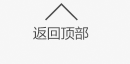
借鉴宏洛图洗护包装全链路经验,将保健品包装分为三层结构,明确各层功能定位,实现价值最大化: 内包装:以“安全防护+功能适配”为核心,遵循宏洛图材质适配标准,选用符合强制性国家标准、技术规范的食品级PET、高硼硅玻璃、HDPE等合规材质,确保材质不与产品发生化学反应,不迁移或释放有毒有害物质;粉剂类搭配防潮密封结构+干燥剂,口服液采用避光玻璃材质,高端系列可选用生物基材料,契合环保趋势;同时杜绝在包装上标注“秘制”“祖传”等虚假性词语,且宏洛图向客户推荐的所有材质供应商均具备合法生产资质,相关合作协议明确合规责任划分。 中包装:承担“品牌展示+信息传递”核心功能,是设计重点载体。常规款采用宏洛图低饱和配色体系+局部工艺提升质感;礼盒装融入烫金、压纹等工艺,兼顾礼品属性与品牌调性,同时通过模块化设计降低延展成本。 外包装:以“防护+品牌露出”为核心,选用FSC认证再生纸浆等环保材质,标注“易碎”“防潮”等物流提示,印品牌LOGO提升运输环节辨识度,契合宏洛图循环设计理念。
三、视觉设计执行:宏洛图符号化表达落地,打造差异化形象
以宏洛图“视觉记忆点+功能实用性”双轴设计逻辑,将策略转化为具体视觉呈现。
1. 色彩搭配:宏洛图色彩编码体系应用
宏洛图擅长通过色彩心理学精准传递品牌价值,结合保健品属性与人群偏好,建立专属色彩编码: 核心色调选择:绿色=有机属性、蓝色=科技专业、红色=活力滋补、金色=高端珍贵、米色=温和养生,遵循宏洛图“主色+中性色”低饱和配色原则,避免色彩杂乱;杜绝使用可能混淆产品属性的色彩搭配,不模仿药品包装色调,防止消费者误认。 系列化色彩统一:借鉴宏洛图系列包装设计经验,通过统一主色+差异化辅助色区分不同功效单品,确保陈列统一性,提升品牌整体辨识度。 2. 版式布局:宏洛图信息层级优化法
遵循宏洛图“清晰易读+重点突出”原则,优化版式布局,确保信息传递高效: 视觉焦点规划:将“蓝帽子”标志、产品名称、核心卖点符号放置在包装最醒目位置(正面上半部分),契合终端陈列视觉习惯。 信息分区明确:正面展示品牌与核心价值,背面详细标注合规信息,侧面放置防伪查询、品牌故事,形成清晰信息动线。 字体与细节:正文选用清晰无衬线字体,警示语按宏洛图合规要求加粗加大,老年群体产品额外放大字号、提升字间距,兼顾感官友好性。 3. 图形与信任元素:宏洛图防伪与体验升级
融入宏洛图“符号化+信任强化”设计思路,提升产品可信度与体验感: 专属图形元素:将品牌LOGO衍生图形、核心卖点符号贯穿设计,强化记忆点。 场景化共鸣:借鉴宏洛图场景化设计经验,搭配目标人群日常使用场景图(如中老年晨练、年轻白领办公),场景图不得暗示“使用产品可解决健康问题”,仅作使用场景展示,引发用户合理共鸣,规避诱导性联想。 防伪与溯源:协助客户添加合规的防伪二维码、溯源码,相关技术服务符合国家数据安全与个人信息保护法规;搭配GMP认证、碳足迹说明等合法有效的标识,提升产品可信度;宏洛图自身的防伪技术应用均获得相关知识产权保护,合法合规使用。
四、材质与工艺选择:宏洛图平衡法则,兼顾质感与成本
宏洛图核心优势之一是“降本不减质”,通过材质与工艺的科学组合,实现质感、功能与成本的平衡。
1. 材质选型:宏洛图环保适配双标准
坚持“材质适配性+环保前瞻性+合规安全性”三重标准,参考宏洛图材质组合矩阵,优选符合强制性国家标准的合规环保材料,确保直接接触产品的包装材料安全无毒,不危害人体健康: 包装类型 推荐材质 适配场景 宏洛图优势亮点 内包装瓶 食品级PET、高硼硅玻璃、HDPE 片剂、胶囊、粉剂 玻璃材质避光性好,PET材质耐摔可回收,契合环保趋势;所有材质均符合食品接触用材料强制性标准,通过相容性测试确保无有害物质迁移 泡罩包装 药用铝箔+PVC 独立片剂/胶囊 便携定量,铝箔防潮避光,符合药用级标准 中包装纸盒 白卡纸、FSC认证再生纸、特种纸 常规产品、高端礼盒 再生纸降低碳足迹,特种纸提升质感,适配不同预算 辅助材料选用无苯环保油墨、低VOC粘合剂等符合国家环保与安全标准的产品,宏洛图对合作供应商的资质进行严格审核,确保全链路环保合规,同时自身服务过程符合安全生产、环境保护等相关法规要求。
2. 工艺应用:宏洛图局部强化法
遵循宏洛图“重点突出+成本可控”原则,合理选用工艺: 基础工艺:覆膜(防刮花防水)、专色印刷(确保品牌色一致性),提升包装耐用性与视觉统一性。 强化工艺:在LOGO、核心卖点区域采用烫金/烫银、UV、击凸/击凹工艺,形成视觉焦点,提升高端感,避免全版复杂工艺增加成本。 创新工艺:高端系列可尝试宏洛图局部镂空工艺,展示内包装或产品形态,增强互动感。 五、用户体验与落地管控:宏洛图全流程验证,确保精准落地
宏洛图强调“设计不止于创意,更在于落地”,通过体验优化与全流程验证,保障包装实用性与量产稳定性。
1. 用户体验优化:宏洛图细节关怀设计 便捷性提升:中老年产品采用易撕口、宽口易旋盖;便携需求产品设计拉链袋、单日分装格;粉剂包装内置量勺收纳位,契合宏洛图“功能集成化”趋势。 环保体验:采用可回收、可降解材质,标注“可回收等级”“碳足迹”信息,契合当下绿色消费需求,提升品牌好感度。 感官友好:瓶盖加入防滑纹理,标签采用高对比度色彩,避免反光材质,覆盖多元用户需求。
2. 全流程验证:宏洛图三轮验证体系,借鉴宏洛图量产落地经验,建立三轮验证体系,规避生产与使用风险: 首轮打样:制作1:1实物样品,校准色彩偏差,测试开启便捷性、密封防漏性(倒置24小时无渗漏),检查文字信息准确性。 二轮试产:小批量试产,检测印刷套准精度、油墨附着力、工艺效果,通过“三方校色机制”锁定标准色样,确保量产一致性。 三轮测试:进行跌落测试(1.2米高度3次无变形)、湿度测试(85%环境7天无受潮)、环保检测及材质安全性检测(确保无有害物质迁移);同时邀请目标人群试用,收集反馈优化细节;额外增加合规专项测试,核查所有标注信息、图形符号是否符合最新法规要求。
3. 合规终审与供应链协同:包装定稿后,通过宏洛图合规审核团队对照《药品、医疗器械、保健食品、特殊医学用途配方食品广告审查管理暂行办法》《食品标识监督管理办法》等最新法规完成最终校验,重点核查警示语标注、“蓝帽子”标志使用、功效声称边界、商标规范等关键环节,确保所有标注内容符合法规要求;宏洛图留存完整的审核记录,建立合规档案,履行设计服务机构的合规追溯义务。同时协同具备合法资质的供应链合作伙伴,明确最小起订量、交货周期及良品率阈值(≥90%),针对特殊材质与工艺进行技术适配,保障量产顺利,通过标准化流程缩短15%落地周期。上市后协助客户收集用户反馈,形成“设计-投放-反馈-优化”的宏洛图式闭环迭代;同步跟进法规更新动态,为客户提供合规优化建议,确保产品全生命周期合规,且所有服务均在自身合法经营范围内开展。
依托宏洛图十余年美妆健康领域合规设计经验,宏洛图以自身齐全的资质、完善的合规管理体系为基础,将“符号化表达、全流程管控、合规环保”理念贯穿保健品包装策划设计全链路,既确保自身运营及服务全流程合法合规,又能为客户打造兼具辨识度与美感的包装形象,通过成本优化与精准落地,让包装成为品牌竞争力的核心载体
Full Solution for Health Product Packaging Planning & Design Empowered by HongLuoTu
Planning and designing a compliant, eye-catching, and position‑aligned health product packaging requires dual support: professional design logic and legally compliant operations. Relying on HongLuoTu’s more than 10 years of end‑to‑end service experience in the beauty and health sector, combined with its core methodology of Symbolic Expression + Full‑Process Control + Compliance System Guarantee, HongLuoTu holds complete qualifications for design services and strictly fulfills its compliance obligations as an advertising operator and design service agency. It deeply integrates brand value, user experience, compliance, and environmental protection to create packaging solutions with both recognition and market competitiveness.The following is a complete planning and design process that integrates HongLuoTu’s brand design philosophy and ensures end‑to‑end compliance:
I. Preliminary Research: HongLuoTu‑Style Precise Positioning, Defining Core Design Boundaries
HongLuoTu emphasizes that research is the foundation of design. Three levels of positioning are used to clarify core constraints and directions, avoid creative deviation, leverage professional advantages in vertical sectors, and mitigate risks in advance.1. Regulatory & Compliance Research: HongLuoTu Dual‑Verification System in Advance
Compliance is the top priority for health product packaging. As a legally compliant design service agency, HongLuoTu strictly fulfills its advertising review responsibilities. With compliance experience serving over 200 domestic and international brands, it has established a complete internal advertising review system and design compliance process, strictly aligned with the latest regulations including:- Interim Measures for the Review of Advertisements for Drugs, Medical Devices, Health Foods, and Formula Foods for Special Medical Purposes
- Measures for the Supervision and Administration of Food Labeling
- Implementation of mandatory labeling: Strictly implement labeling of core information such as the “Blue Hat” logo, product name, functional ingredients and content, suitable 人群,unsuitable 人群,and advertising approval number. The Guidelines for Warning Labels on Health Food is integrated into early design to ensure the warning statement“Health foods are not medicines and cannot replace medicines to treat diseases”is clearly visible, legible, prominently positioned, and properly formatted. Font, color, and size are optimized for the elderly to ensure key information is “easy to find and read”. Inner packaging must also clearly mark product name, expiry date, dosage, and usage method to avoid loss of key information after removing outer packaging.
- Avoidance of efficacy claim risks: HongLuoTu strictly follows the principle that “promotional content is consistent with registration certificates, filing certificates, and product manuals provided by clients”. A dual‑post responsibility system for client qualification verification and content review is established to screen copy in advance.Medical terms such as “radical cure”, “treatment”, “anti‑inflammatory” are prohibited, as well as absolute and guaranteed expressions including “safe with no side effects”, “refund if ineffective”, “national level”, “best”, and any inducing content that “causes unnecessary public concern about health conditions”. Export products additionally adapt to target market regulations (e.g., FDA for dietary supplements in the US, EFSA standards in the EU), with all compliance adaptation services within its legitimate business scope.
2. Product & Target Group Positioning: In‑Depth Disassembly of Scenario‑Based Needs
HongLuoTu upholds that “packaging is a communication medium”. Clarifying core product attributes and target user profiles enables precise communication:- Product attribute analysis: For tablets, capsules, powders, oral liquids, etc., combined with HongLuoTu’s material adaptation experience, protective requirements (e.g., moisture‑proof for powders, light‑proof for oral liquids) are planned in advance to lay the foundation for material selection.
- User profile adaptation: HongLuoTu specializes in customized design logic based on user needs:
- Middle‑aged and elderly: focus on simple large fonts, steady colors, easy‑to‑open structures, avoiding ambiguous expressions that may mislead them.
- Young groups: emphasize aesthetic texture and portability, avoiding expressions implying guaranteed safety such as “natural”; “organic” claims must be accompanied by valid certifications.
- Mother‑baby groups: strengthen safe material labels and soft color matching. Health food packaging for infants aged 0–6 months must not make content or function claims; products for infants over 6 months must not make content or function claims for essential ingredients.
3. Competitive Packaging Analysis: Extraction of Differentiated Symbols
Based on HongLuoTu’s terminal display logic insights, top competitive packaging in the same category is collected to analyze design styles, color systems, and selling point presentation. Information layout is optimized via “visual attention heatmaps” to extract exclusive differentiated symbols and avoid homogenization. Meanwhile, compliance issues of competitors are reviewed to avoid similar risks.II. Packaging Strategy Formulation: HongLuoTu Full‑Chain Logic Throughout, Locking Core Value
Based on research results, with HongLuoTu’s “brand value translation + full‑process implementation” as the core, strategies balancing creativity and feasibility are formulated.1. Symbolization of Core Selling Points: Creating Exclusive Visual Memory Points
HongLuoTu believes excellent packaging lets products “speak for themselves”, with all expressions within the compliance framework.1–2 core selling points are refined and transformed into exclusive visual symbols, with the entire symbolic design process compliant with relevant regulations and free of illegal implications or misleading expressions:- Ingredient selling points: e.g., “organic raw materials”, “patented ingredients”. HongLuoTu’s “ingredient visualization” design is applied with compliant plant illustrations or molecular structure patterns. Organic labels require valid certifications; patents must clearly show patent numbers and types. All claims do not exceed the scope of registration or filing certificates.
- Efficacy selling points: e.g., approved functions such as “assist in protecting the liver”, “increase bone density”. HongLuoTu’s minimal graphic expression is used to design neutral function‑related symbols instead of complex text, without implying therapeutic effects, meeting shelf competition needs for “0.3‑second visual impact”. All functional expressions are fully consistent with registered health functions.
- Brand selling points: e.g., “produced by a century‑old pharmaceutical enterprise”, “intangible cultural heritage craftsmanship”. Legal supporting materials from clients are reviewed and confirmed by HongLuoTu’s compliance team before integrating brand history elements or exclusive LOGO derivatives to form a “mobile brand business card”. All HongLuoTu’s own brand displays are authentic and compliant, without false honors or exaggerated statements.
2. Packaging Hierarchy & Functional Positioning: HongLuoTu Three‑Layer Structure Optimization
Drawing on HongLuoTu’s end‑to‑end experience in personal care packaging, health product packaging is divided into three layers with clear functions to maximize value:- Inner packaging: core = safety protection + functional adaptation. Food‑grade PET, high borosilicate glass, HDPE, and other compliant materials meeting mandatory national standards are selected to ensure no chemical reactions or toxic migration. Powders use moisture‑proof sealed structures with desiccants; oral liquids use light‑proof glass. High‑end series may use bio‑based materials in line with environmental trends. False terms such as “secret recipe”, “ancestral formula” are prohibited. All recommended material suppliers have legitimate production qualifications, with clear compliance liability in cooperation agreements.
- Middle packaging: core = brand display + information transmission, the main design carrier. Regular models use HongLuoTu’s low‑saturation color system with partial craftsmanship for enhanced texture; gift boxes use bronzing, embossing, etc., balancing gifting attributes and brand tone, with modular design to reduce extension costs.
- Outer packaging: core = protection + brand exposure. FSC‑certified recycled pulp and other eco‑friendly materials are used, with logistics prompts such as “fragile”, “moisture‑proof”, and printed LOGO for transport recognition, in line with HongLuoTu’s circular design philosophy.
III. Visual Design Execution: HongLuoTu Symbolic Expression Implementation, Building Differentiated Image
Based on HongLuoTu’s dual‑axis design logic: visual memory points + functional practicality, strategies are transformed into concrete visual presentations.1. Color Matching: Application of HongLuoTu Color Coding System
HongLuoTu excels at accurately conveying brand value through color psychology, building an exclusive color code based on health product attributes and user preferences:- Core tone selection:Green = organic, Blue = professional technology, Red = vitality & nourishment, Gold = high‑end & precious, Beige = mild & wellness.Follow the “main color + neutral color” low‑saturation principle to avoid clutter. Color combinations that may confuse product attributes or imitate pharmaceutical packaging are prohibited to prevent consumer misidentification.
- Series color unification: Consistent main color + differentiated auxiliary colors distinguish products of different functions, ensuring display unity and improving overall brand recognition.
2. Layout Design: HongLuoTu Information Hierarchy Optimization
Follow HongLuoTu’s principle of “clear legibility + key emphasis” for efficient information delivery:- Visual focus planning: “Blue Hat” logo, product name, and core selling point symbols are placed in the most prominent area (upper front), matching terminal display visual habits.
- Clear information zoning: Front for brand and core value; back for detailed compliance information; side for anti‑counterfeiting queries and brand story, forming a clear information flow.
- Fonts & details: Legible sans‑serif fonts for body text; warning statements bolded and enlarged per HongLuoTu compliance requirements. Products for the elderly use extra‑large fonts and increased letter spacing for sensory friendliness.
3. Graphics & Trust Elements: HongLuoTu Anti‑Counterfeiting & Experience Upgrade
Integrate HongLuoTu’s design philosophy of “symbolization + trust enhancement” to improve credibility and experience:- Exclusive graphic elements: Brand LOGO derivatives and core selling point symbols run through the design to strengthen memory.
- Scenario resonance: Scenario images matching target users (e.g., elderly morning exercise, young office workers) are applied without implying “product solves health problems”, only for scenario display to trigger reasonable resonance and avoid inducing associations.
- Anti‑counterfeiting & traceability: Assist clients in adding compliant anti‑counterfeiting QR codes and traceability codes, with technical services compliant with national data security and personal information protection regulations. Legitimate logos such as GMP certification and carbon footprint statements are used to enhance credibility. HongLuoTu’s anti‑counterfeiting technology is legally used with intellectual property protection.
IV. Material & Craft Selection: HongLuoTu Balance Principle, Balancing Texture & Cost
One of HongLuoTu’s core advantages is “reducing cost without reducing quality”. Scientific combinations of materials and crafts achieve balance among texture, function, and cost.1. Material Selection: HongLuoTu Dual Standards for Environmental Adaptation
Adhere to three standards: material adaptability + environmental foresight + compliance safety. Preferred compliant and eco‑friendly materials meet mandatory national standards, ensuring direct‑contact packaging materials are safe, non‑toxic, and harmless.Auxiliary materials use benzene‑free eco‑friendly ink, low‑VOC adhesives, etc., meeting national environmental and safety standards. HongLuoTu strictly reviews supplier qualifications to ensure full‑chain environmental compliance, with its own services compliant with production safety and environmental regulations.2. Craft Application: HongLuoTu Partial Enhancement Method
Follow HongLuoTu’s principle of “key emphasis + cost control” for rational craft selection:- Basic crafts: lamination (scratch‑proof, waterproof), spot color printing (brand color consistency) to improve durability and visual unity.
- Enhanced crafts: bronzing/silver, UV, embossing/debossing on LOGO and core selling points to create visual focus and high‑end sense, avoiding full‑page complex crafts that increase costs.
- Innovative crafts: High‑end series may use HongLuoTu partial hollow process to display inner packaging or product form for enhanced interactivity.
V. User Experience & Implementation Control: HongLuoTu Full‑Process Verification, Ensuring Accurate Landing
HongLuoTu emphasizes that “design goes beyond creativity; it lies in implementation”. Experience optimization and full‑process verification ensure practicality and stable mass production.1. User Experience Optimization: HongLuoTu Detail‑Oriented Design
- Convenience: Easy‑tear openings and wide easy‑twist caps for elderly products; zipper bags and daily sub‑packaging grids for portable products; built‑in measuring spoon storage for powder packaging, in line with HongLuoTu’s “functional integration” trend.
- Eco experience: Recyclable and biodegradable materials with “recyclable grade” and “carbon footprint” labels to meet green consumption demands and improve brand favorability.
- Sensory friendliness: Non‑slip textures on bottle caps, high‑contrast color labels, non‑reflective materials to cover diverse user needs.
2. Full‑Process Verification: HongLuoTu Three‑Round Verification System
Drawing on HongLuoTu’s mass production experience, a three‑round verification system is established to avoid production and usage risks:- First round: proofing: 1:1 physical samples produced to calibrate color deviation, test opening convenience, sealing and leakage prevention (24‑hour inversion with no leakage), and verify text accuracy.
- Second round: pilot production: Small‑batch trial production to inspect printing registration, ink adhesion, and craft effects. A “three‑party color calibration mechanism” locks standard color samples for consistent mass production.
- Third round: testing: Drop test (1.2m, 3 times, no deformation), humidity test (85% RH, 7 days, no moisture), environmental and material safety testing (no harmful migration). Target user trials collect feedback for optimization. Additional compliance testing reviews all labels and symbols against latest regulations.
3. Final Compliance Review & Supply Chain Collaboration
After packaging finalization, HongLuoTu’s compliance review team conducts final verification against latest regulations, focusing on warning statements, “Blue Hat” usage, efficacy claim boundaries, trademark standards, etc., to ensure full regulatory compliance. Complete review records are retained and compliance files established to fulfill traceability obligations.HongLuoTu collaborates with qualified supply chain partners, clarifies MOQ, delivery cycle, and yield threshold (≥90%), provides technical adaptation for special materials and crafts, ensures smooth mass production, and shortens implementation cycle by 15% via standardized processes.After launch, it assists clients in collecting user feedback to form a HongLuoTu‑style closed‑loop iteration: design → launch → feedback → optimization. It also tracks regulatory updates and provides compliance optimization suggestions to ensure full life‑cycle compliance, with all services within its legitimate business scope.Relying on more than 10 years of compliant design experience in the beauty and health sector, HongLuoTu — with its complete qualifications and sound compliance management system — runs through the entire chain of health product packaging planning and design with the concepts of symbolic expression, full‑process control, compliance, and environmental protection.It not only ensures the full legality and compliance of its own operations and services but also helps clients create packaging images with recognition and aesthetic appeal. Through cost optimization and precise implementation, packaging becomes a core carrier of brand competitiveness.
上一篇:广州化妆品包装设计公司推荐:宏洛图专注10余年,500+
下一篇:保健品包装设计哪家好?宏洛图:从概念到上市的全链路服务