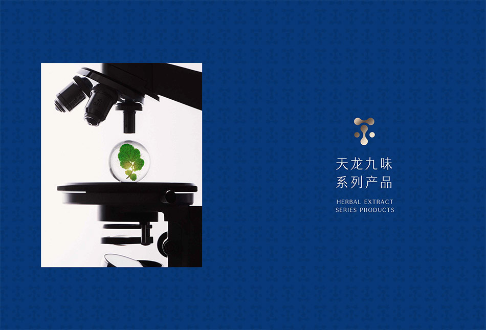
化妆品TIANLONGJIUWEI 天龙九味品牌包装设计
项目名称:天龙九味植萃本草护肤全案包装设计
Project Name:TIANLONGJIUWEI Herbal Plant Skincare Full Case Packaging Design
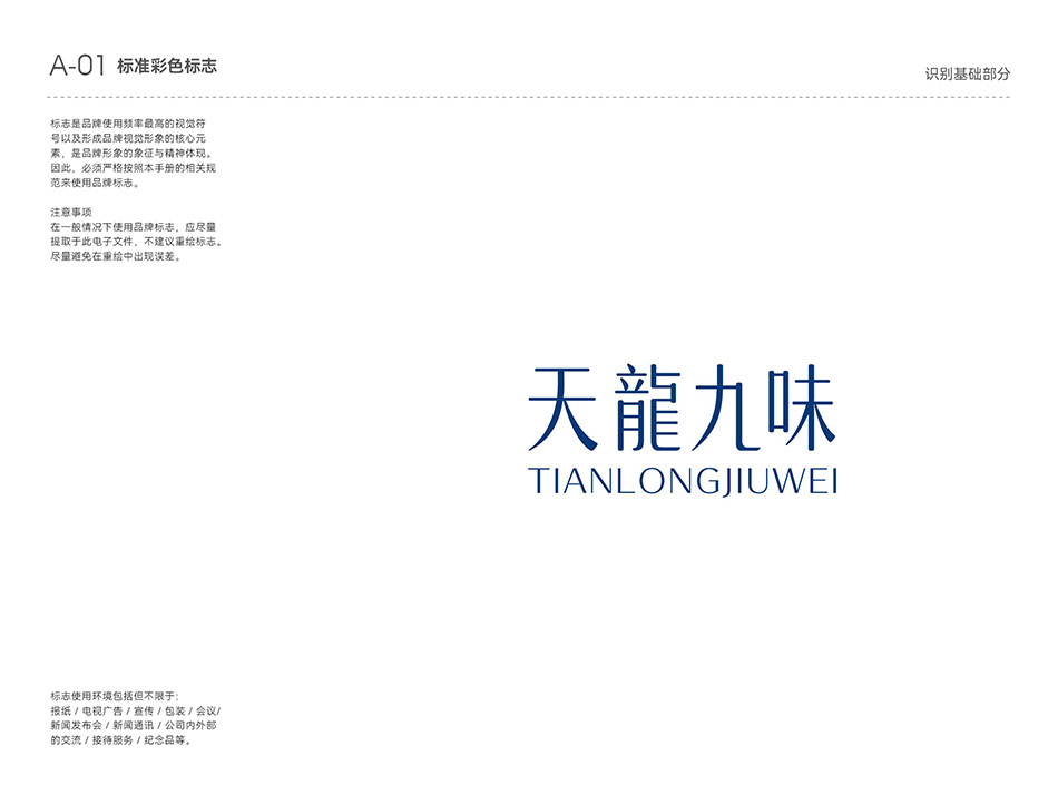
服务品牌:天龙九味 TIANLONGJIUWEI
Brand Served:TIANLONGJIUWEI
服务机构:宏洛图品牌设计
服务内容:品牌视觉体系搭建、全系列本草护肤品包装设计、瓶型结构定制、产品版面信息设计、专属礼盒套装设计、产品商业视觉创意
Service Content:Brand Visual System Construction, Full-line Herbal Skincare Packaging Design, Custom Bottle Structure Design, Product Layout Design, Exclusive Gift Box Set Design, Product Commercial Visual Rendering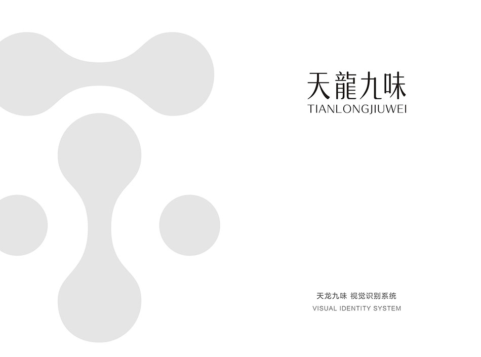
一、核心定位 | Core Positioning
新中式高端草本护肤包装New Chinese Style High-End Herbal Skincare Packaging
以「传统本草智慧」融合「现代轻奢审美」,打造高辨识度品牌视觉Blending "Traditional Herbal Wisdom" with "Modern Luxury Aesthetics" to create a highly recognizable brand visual.
二、核心创意拆解 | Core Creative Breakdown
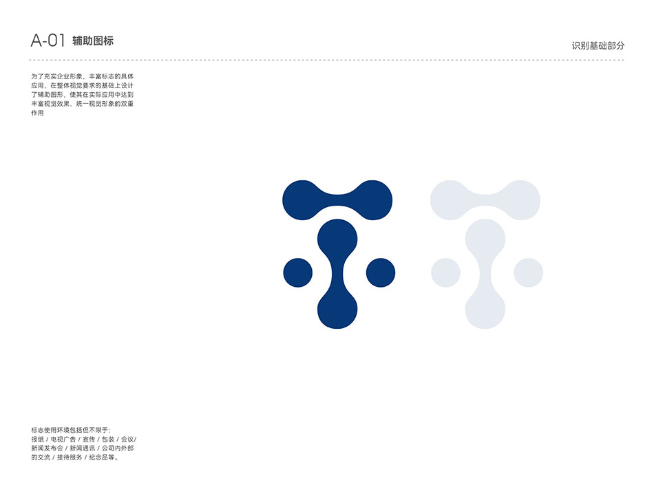
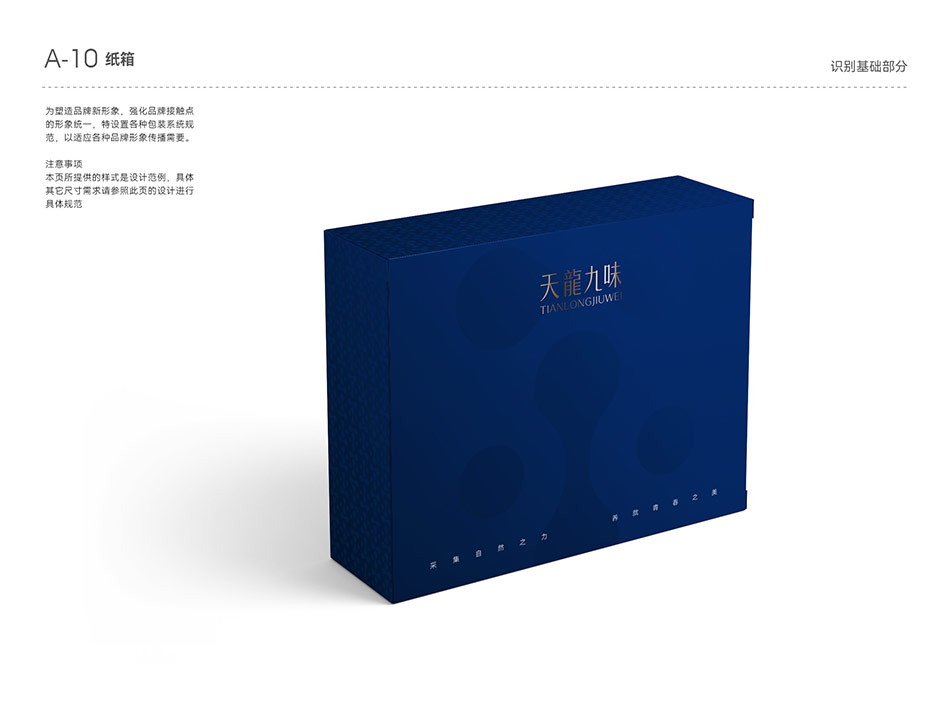
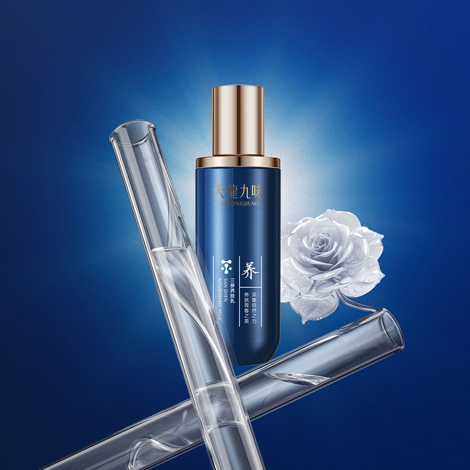
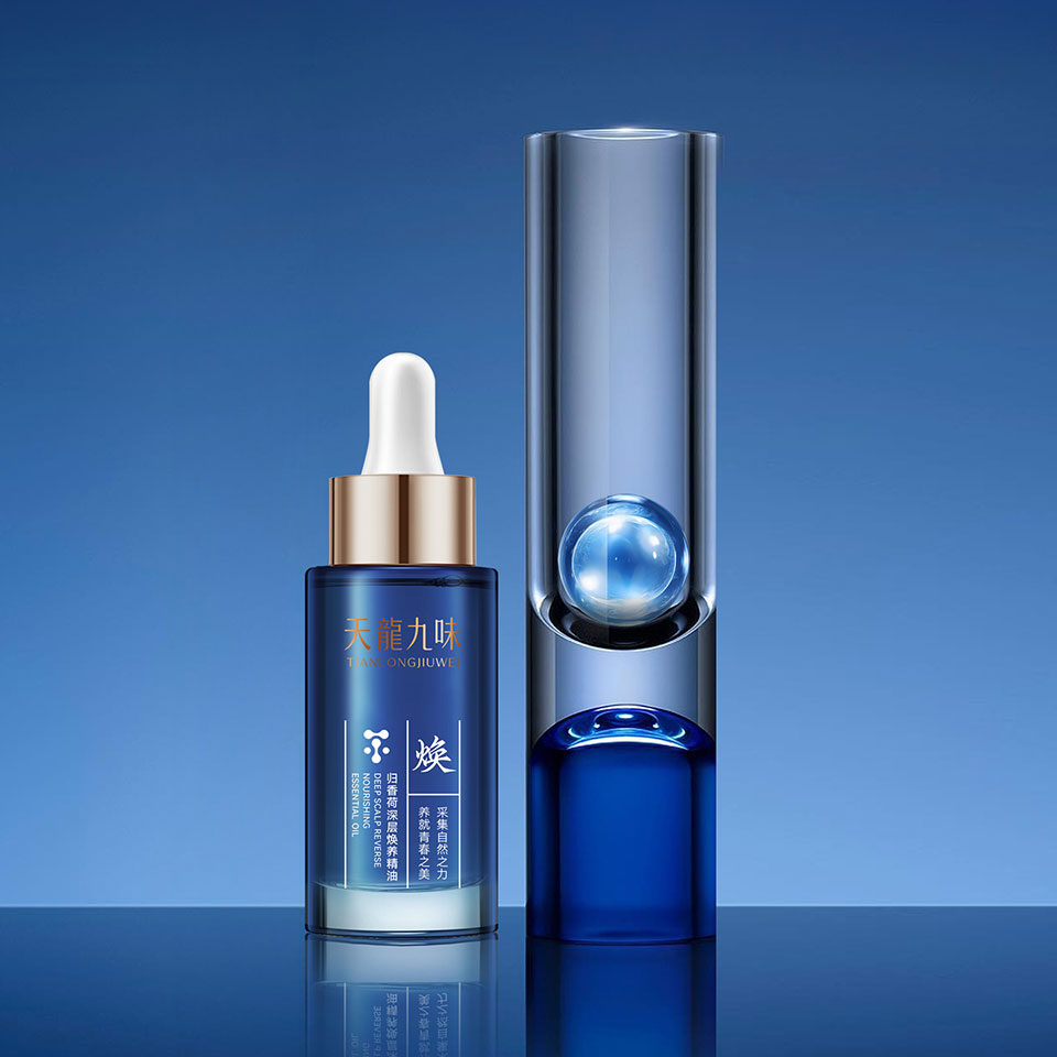
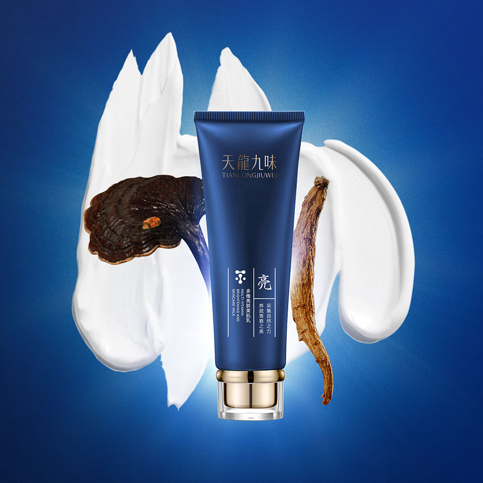
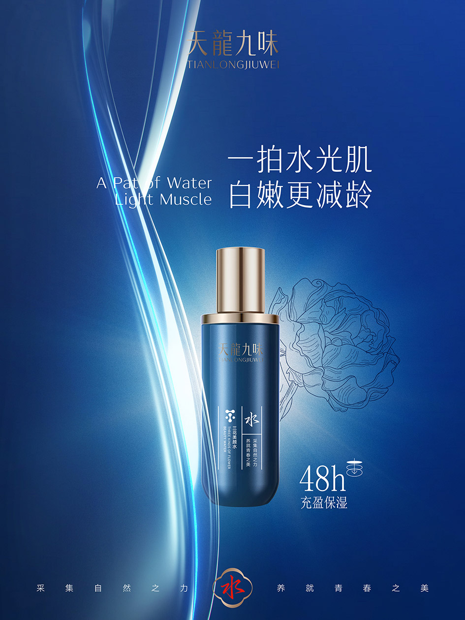
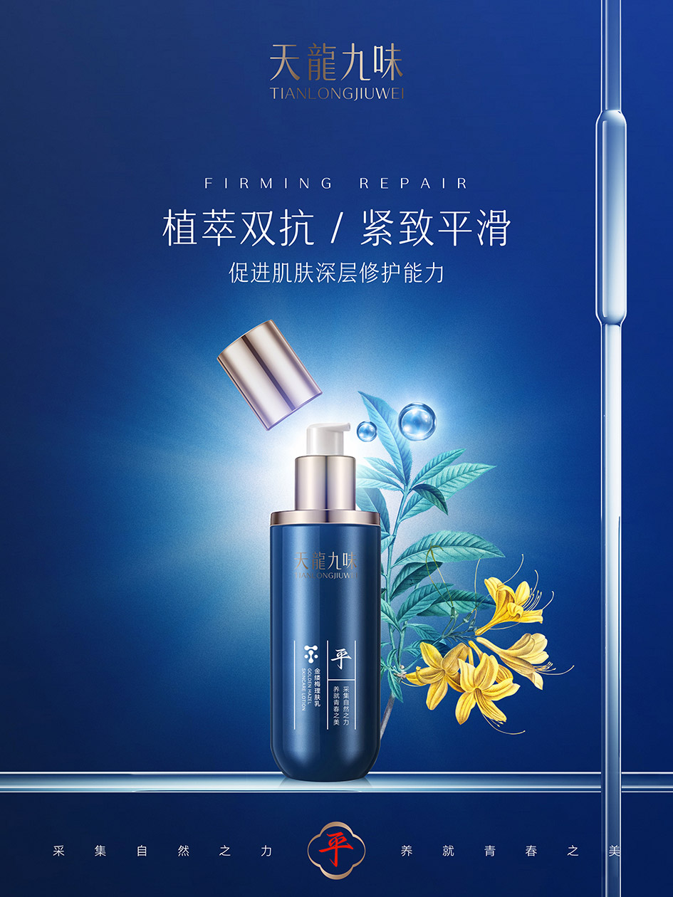
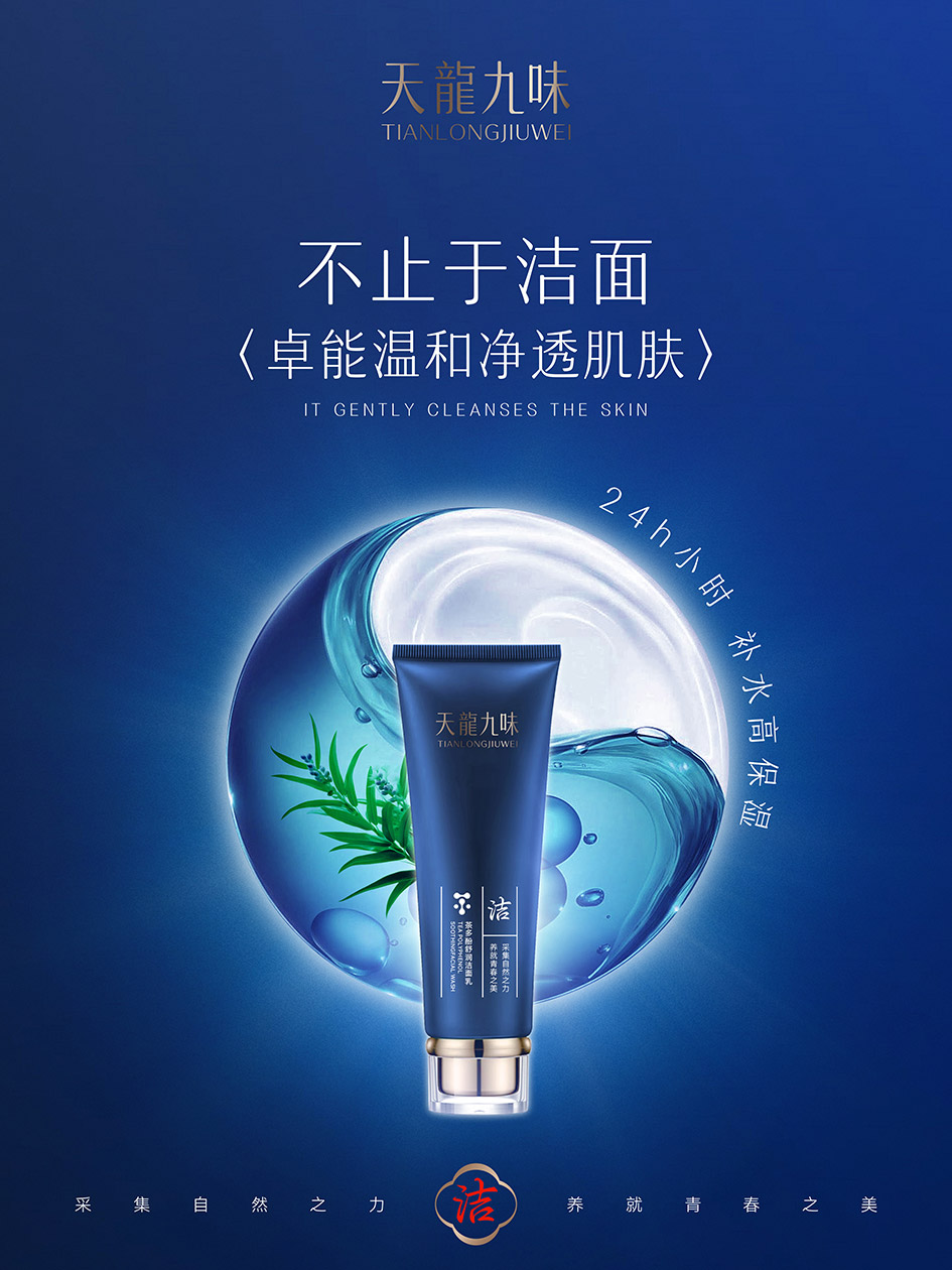
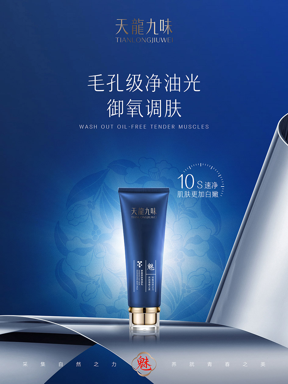
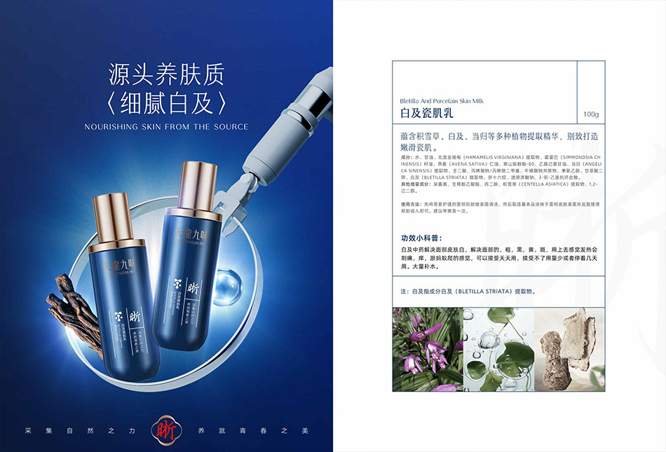
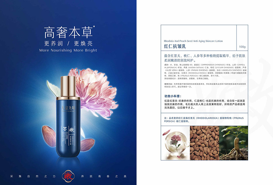
1. 色彩:蓝金定调,高端感拉满 | Color: Blue-Gold Tone, Ultimate Luxury
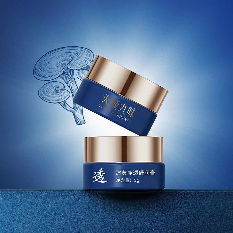
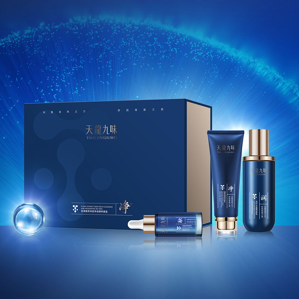
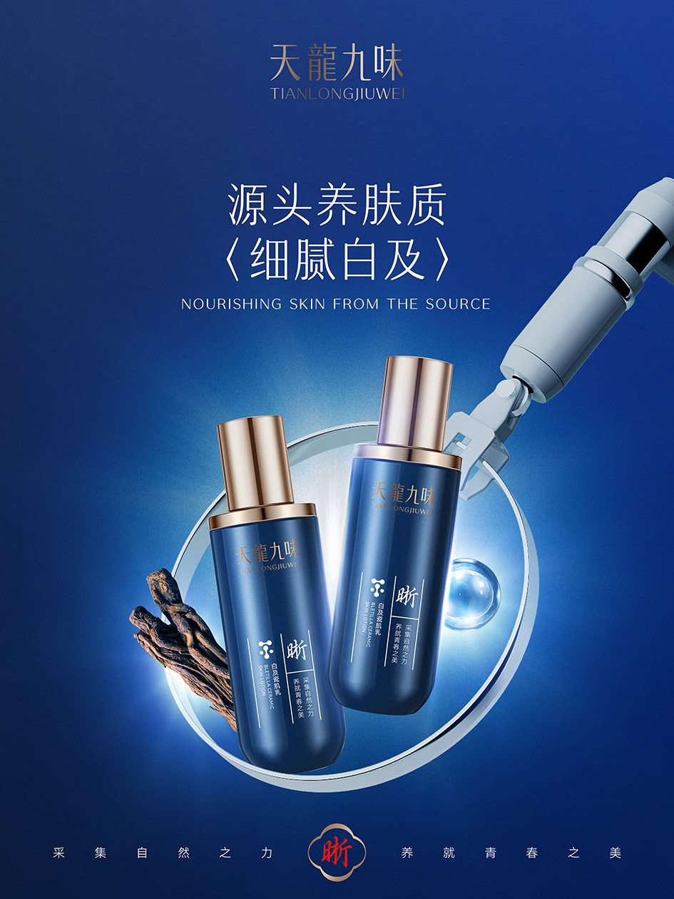
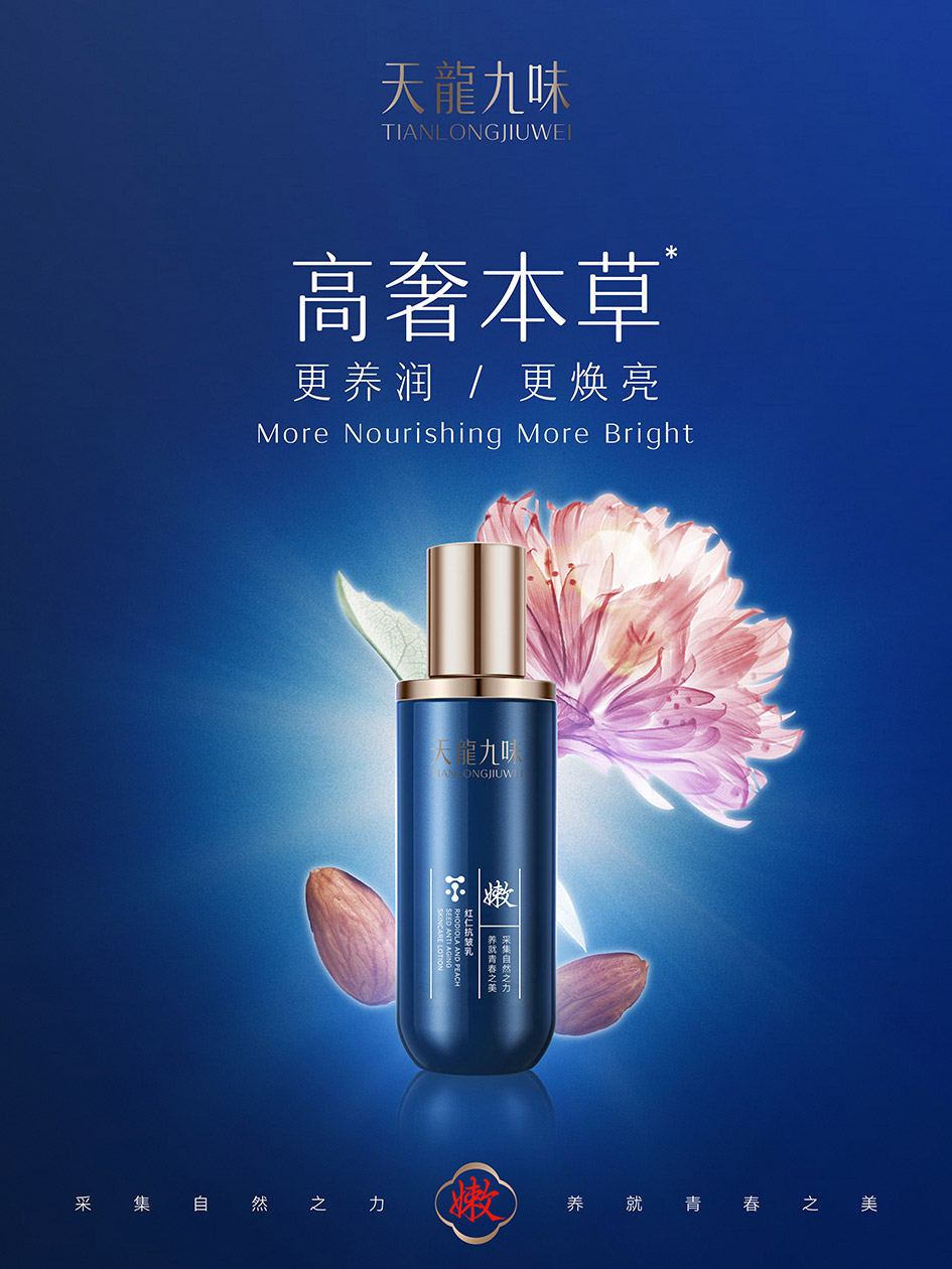
主色深海蓝 | Main Color: Deep Ocean Blue
呼应「天龙」意象,传递纯净、滋养、专业的护肤感知,建立高端品牌壁垒Echoes the "Tianlong (Heavenly Dragon)" imagery, conveys a sense of purity, nourishment and professionalism, establishing a high-end brand barrier.
点缀金属金 | Accent: Metallic Gold
提升产品贵重感,隐喻本草精粹的黄金配比,强化高端礼盒属性Enhances product value, symbolizes the golden ratio of herbal extracts, and strengthens the premium gift set positioning.
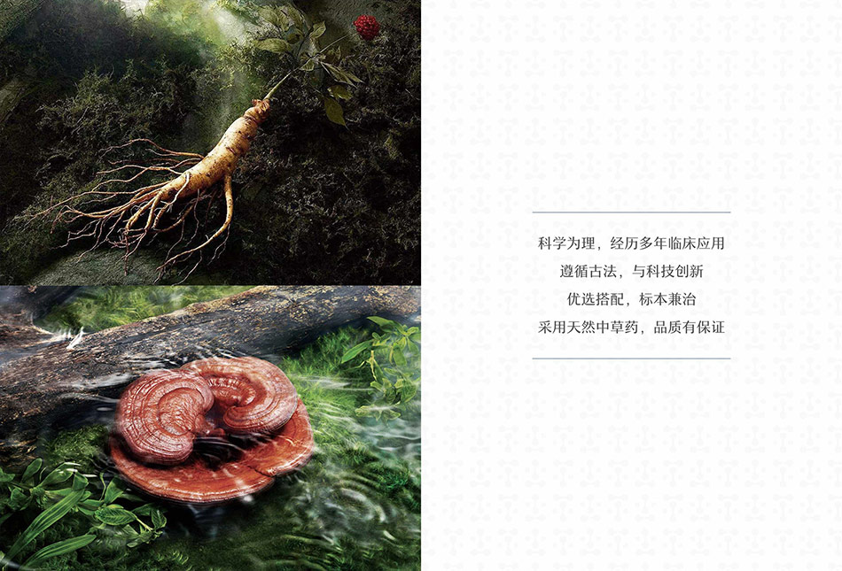
2. 元素:本草具象,功效可视化 | Elements: Herbal Visualization, Benefit Communication
核心符号:灵芝 / 人参 | Core Symbols: Ganoderma/Ginseng
以真实食材、线描插画呈现,直观传递「中药养肤、天然溯源」的核心卖点Presented with real ingredients and line art, intuitively conveying the core selling point of "TCM skincare, natural origin".
辅助意象:白玫瑰 / 水珠 | Auxiliary Imagery: White Rose/Water Droplets
具象化「焕亮、水润、渗透」功效,让消费者一眼读懂产品价值Visualizes "brightening, hydrating, penetrating" benefits, helping consumers instantly understand product value.
3. 版式:新中式极简,文化感拉满 | Layout: Minimalist New Chinese, Cultural Elegance
竖排典籍式排版 | Vertical Classic-style Typesetting
复刻古医药典籍版式,搭配「养 / 焕 / 亮 / 透 / 净 / 润」单字符号,清晰区分系列,兼具东方雅致与现代极简Replicates ancient TCM classic layout, paired with single-character symbols (Nourish/Revitalize/Brighten/Purify/Cleanse/Moisturize) for clear series differentiation, combining oriental elegance with modern minimalism.
品牌 slogan 统一 | Unified Brand Slogan
「采集自然之力,养就青春之美」| "Harness the Power of Nature, Nurture the Beauty of Youth"
贯穿全系列,强化品牌理念Runs through the entire product line to strengthen the brand concept.
4. 质感:科技赋能,传统新生 | Texture: Technology Empowers Tradition
玻璃 / 亚克力瓶身 + 金属瓶盖,兼顾现代工业精致感与东方美学Glass/Acrylic bottles with metal caps, combining modern industrial craftsmanship with oriental aesthetics.
渐变光晕背景,营造专业实验室氛围,体现「现代科技萃取传统草本」的品牌理念Gradient halo background creates a professional laboratory atmosphere, embodying the brand concept of "modern technology extracting traditional herbs".
三、创意总结 | Creative Summary
以蓝金撞色立高端,以本草图腾传功效,以极简版式承文化,打造「传统不陈旧,现代不浮躁」的新中式护肤包装,完美适配高端礼盒与市场竞争。Establishes premium positioning with blue-gold color contrast, communicates benefits with herbal totems, and inherits culture with minimalist layout, creating a New Chinese skincare packaging that is "traditional yet modern, elegant yet trendy", perfectly suited for high-end gift sets and market competition.
联系电话:13660525504
上一篇:ChoiDo清颜堂(清颜美科)品牌包装设计
下一篇:SIND BETH仙德贝思品牌设计