服务客户:ChoiDo清颜美科
项目品类:祛痘护肤品 / 功效型护肤系列
服务内容:品牌视觉规范、全系列产品包装设计、瓶型视觉优化、功效信息排版设计
设计风格:清爽净透、简约专业、净痘控油、干净通透、无彩妆感
服务机构:宏洛图品牌设计
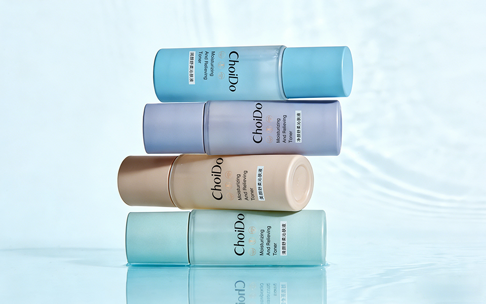
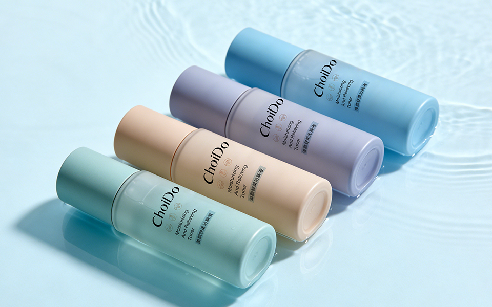
| 产品系列 | 主色调 | 功效 | 设计逻辑(宏洛图色彩心理学) |
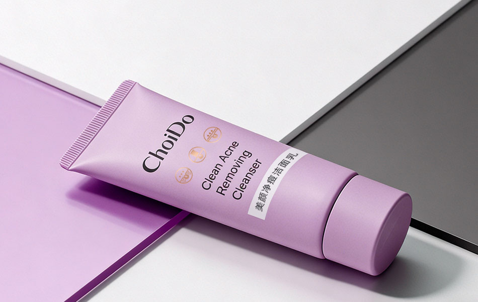
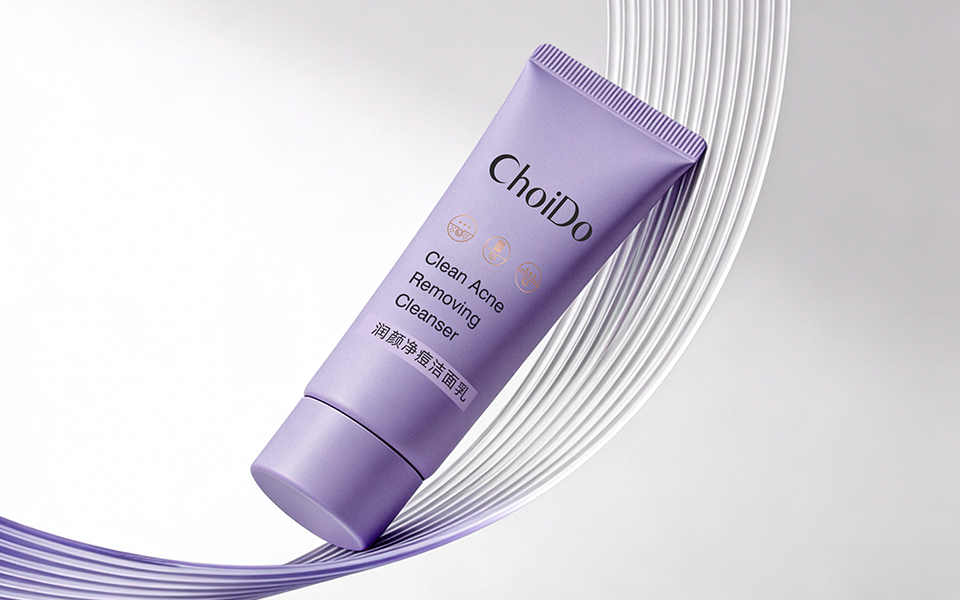
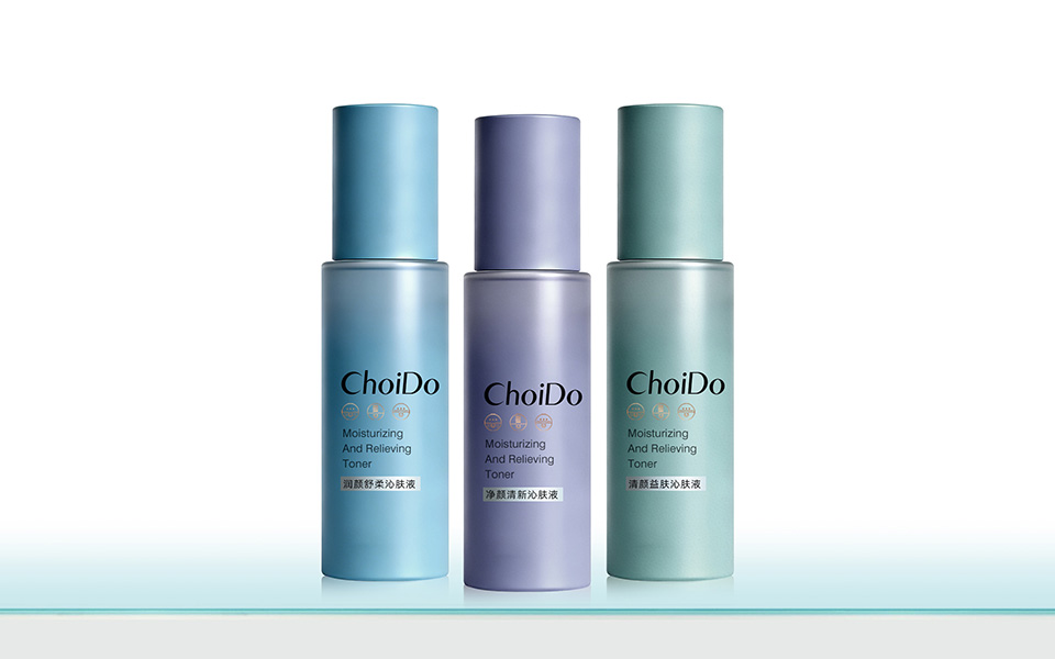
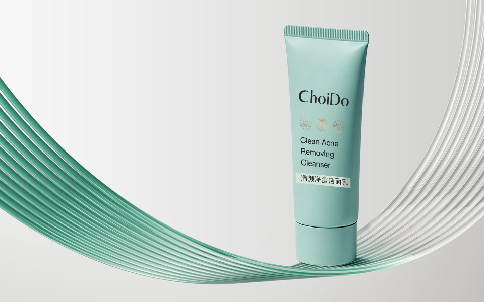
| 痘肌护理 | 薄荷绿 | 净痘控油 | 绿色=清爽、净透、祛痘,直击痘肌痛点 |
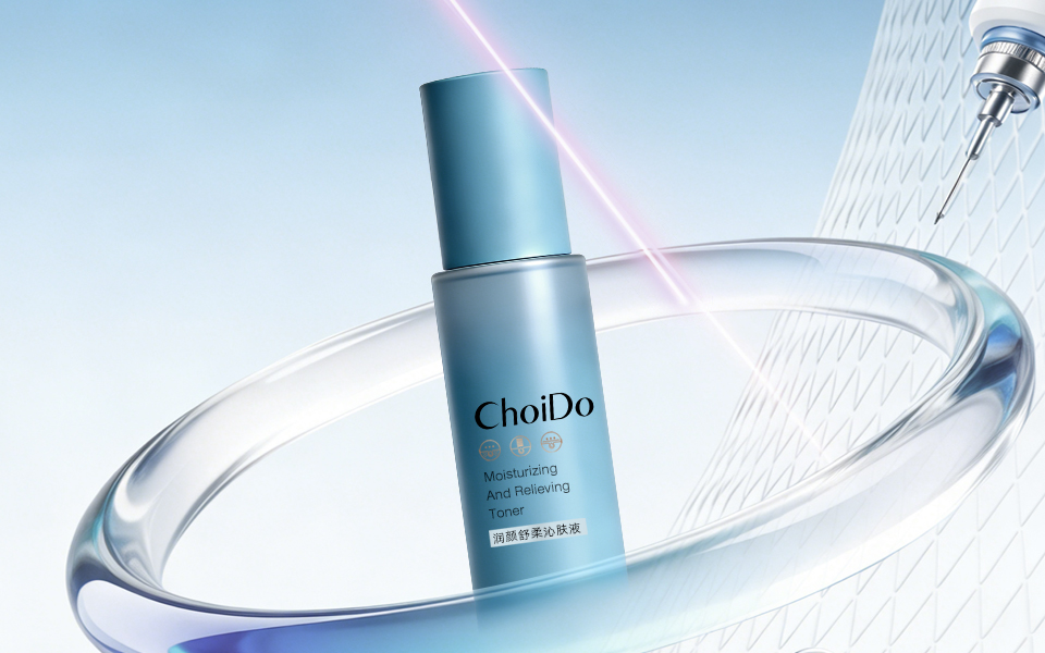
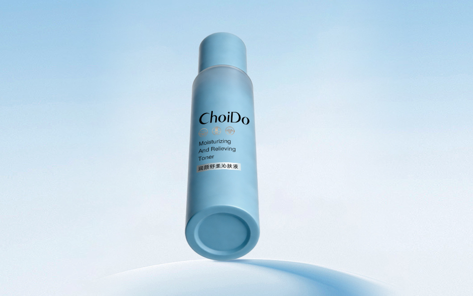
| 敏感修护 | 浅蓝 | 舒缓保湿 | 蓝色=温和、水润、安心,适配敏感肌 |
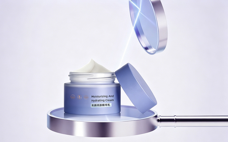
| 亮肤祛斑 | 雾感紫 | 提亮嫩肤 | 紫色=高端、焕亮、抗氧,匹配美白功效 |
清颜堂包装由宏洛图品牌设计量身打造,紧扣品牌「广州专业面部护理,专注祛斑、祛痘、嫩肤,服务年轻群体」定位,以专业院线感 + 年轻化视觉为核心思路。
The packaging of ChoiDo is tailor-made by HongLuotu Brand Design, based on the brand positioning—professional facial care in Guangzhou, focusing on freckle removal, acne treatment and skin rejuvenation for young people, with professional medical beauty style and youthful vision as the core.
品牌定位可视化 / Brand Positioning Visualization
极简医美风格、磨砂质感与科技线条,强化院线级护肤专业度。Minimalist medical beauty style, frosted texture and technological lines enhance the professionalism of salon-level skin care.
功效色彩化 / Efficacy Visualization by Color绿(祛痘)、蓝(舒缓)、紫(亮肤)区分功效,直观易懂。Green (acne removal), blue (soothing), purple (brightening) to distinguish effects, intuitive and easy to understand. 年轻化审美 / Youthful Aesthetics
低饱和渐变色调 + 简约版式,贴合年轻客群审美。Low-saturation gradient colors + simple layout, catering to young consumers.
家族化统一设计 / Unified Series Design统一视觉符号与排版,提升品牌识别度与陈列效果。Unified visual symbols and layout improve brand recognition and display effect.
整体设计专业、简洁、好识别,精准传递清颜堂科学有效护肤形象。The overall design is professional, concise and recognizable, accurately conveying ChoiDo's scientific and effective skin care image.
联系电话:13660525504
上一篇:MIANJISHIGUANG面玑时光套盒包装设计
下一篇:TIANLONGJIUWEI天龙九味品牌设计