SOBEI Premium Gene Anti-Aging Brand Packaging Design
核心定位:美国高端基因抗衰品牌,主打端粒酶逆转录酶产品,以基因技术延长人类寿命。
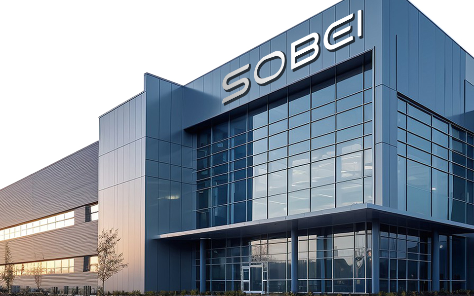
设计方:广州宏洛图品牌设计公司,专注化妆品 / 保健品高端包装与品牌视觉。
Core PositioningA premium U.S. gene anti-aging brand focused on telomerase reverse transcriptase products, leveraging genetic technology to extend human lifespan.
Design FirmGuangzhou Honglt Brand Design Co., Ltd. — Specializes in high-end packaging and brand visual design for cosmetics and health supplements.
视觉与信息设计
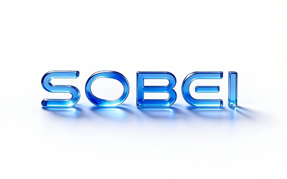
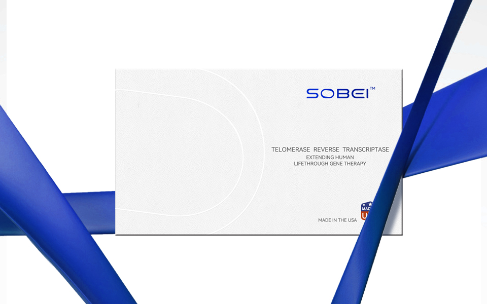
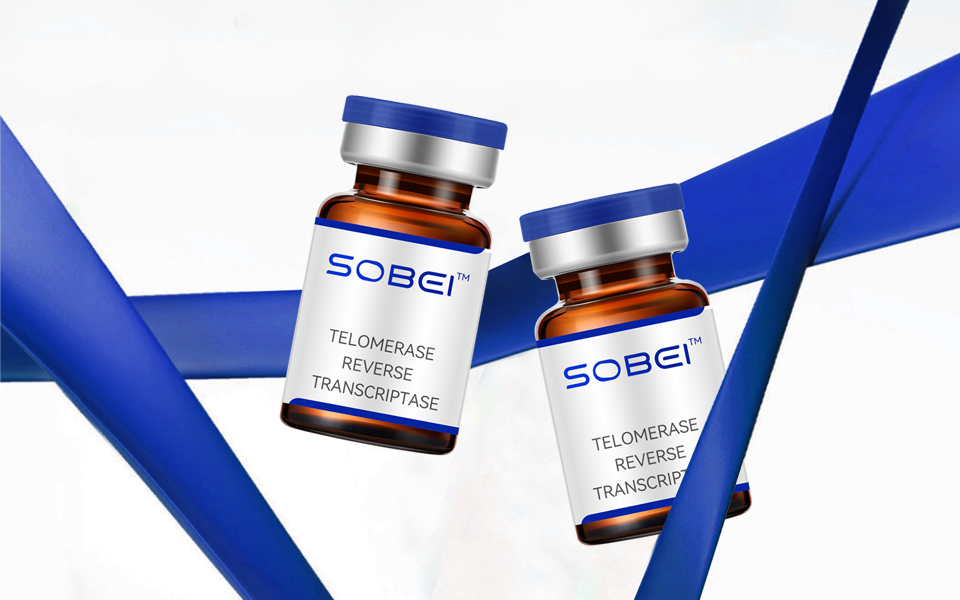
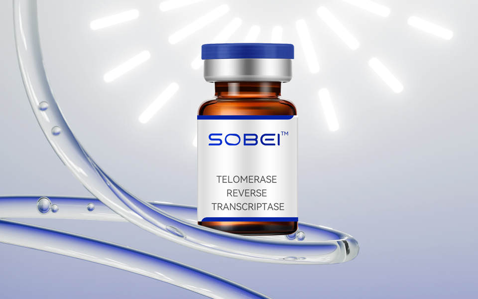
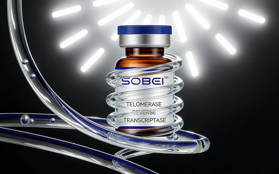
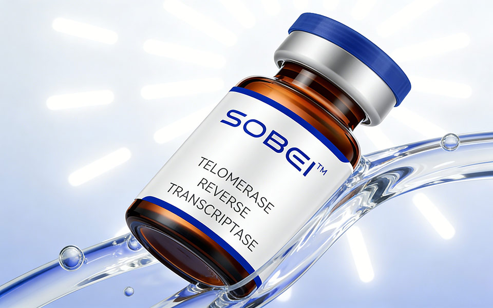
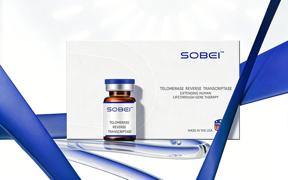
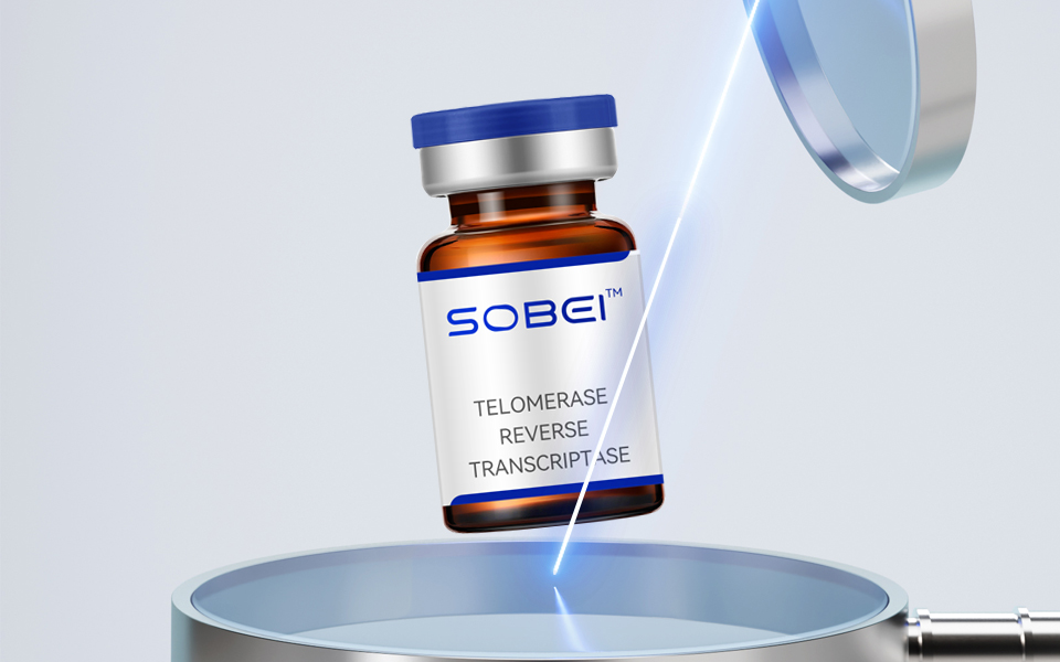
色彩:科技蓝 + 纯净白,传递专业、安全、高端的生物科技感。
符号:外盒曲线隐喻 DNA 双螺旋,场景道具强化生命分子活性,呼应基因抗衰核心。
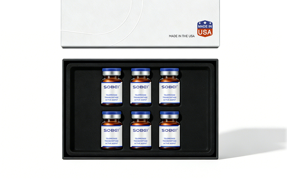
版式:SOBEI™ 品牌标识醒目,核心成分、价值主张、美国产地背书层级清晰,符合医疗产品严谨规范。
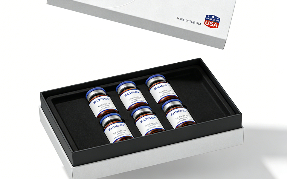
材质:纹理特种纸外盒 + 琥珀色避光药瓶,兼顾活性成分保护与轻奢医疗质感。
Visual & Information Design
Color Palette: Tech blue + pure white, conveying professionalism, safety, and a high-end biotech aesthetic.Symbolism: The curved lines on the outer box metaphorize the DNA double helix, while scene props emphasize the activity of life molecules, echoing the core concept of gene anti-aging.
Layout: The SOBEI™ brand identity is prominently displayed, with clear hierarchies for core ingredients, value propositions, and U.S. origin endorsements, adhering to rigorous medical product standards.
Materials: Textured specialty paper outer box + amber-colored light-proof vial, balancing protection for active ingredients with a luxurious medical-grade texture.
设计价值
以极简视觉语言翻译生命科学,平衡专业严谨与消费友好,塑造国际高端抗衰品牌形象,助力品牌精准触达目标用户与市场拓展。
Design Value
Translating life science into a minimalist visual language, this design balances professional rigor with consumer-friendliness, shaping an international premium anti-aging brand image and empowering the brand to precisely reach its target audience and drive market expansion.
联系电话:13660525504
上一篇:美国防晒MEBO美宝品牌包装设计
下一篇:护肤品STARZUER品牌包装设计