设计理念 Design Concept
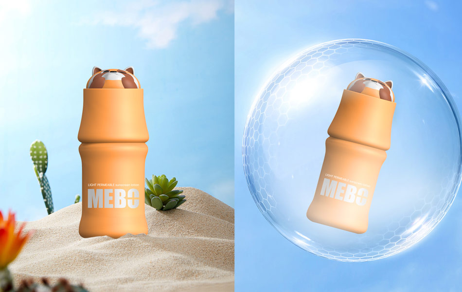
本款 MEBO 防晒产品由宏洛图品牌设计公司全案原创设计。
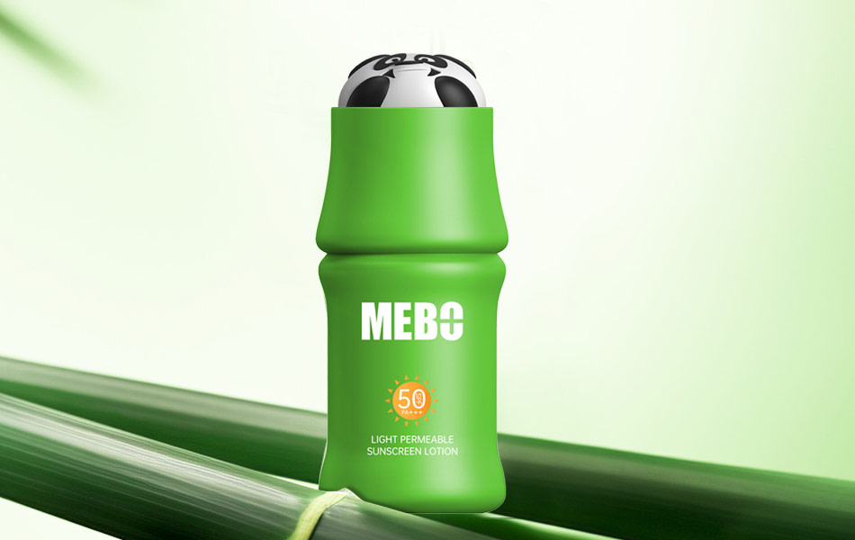
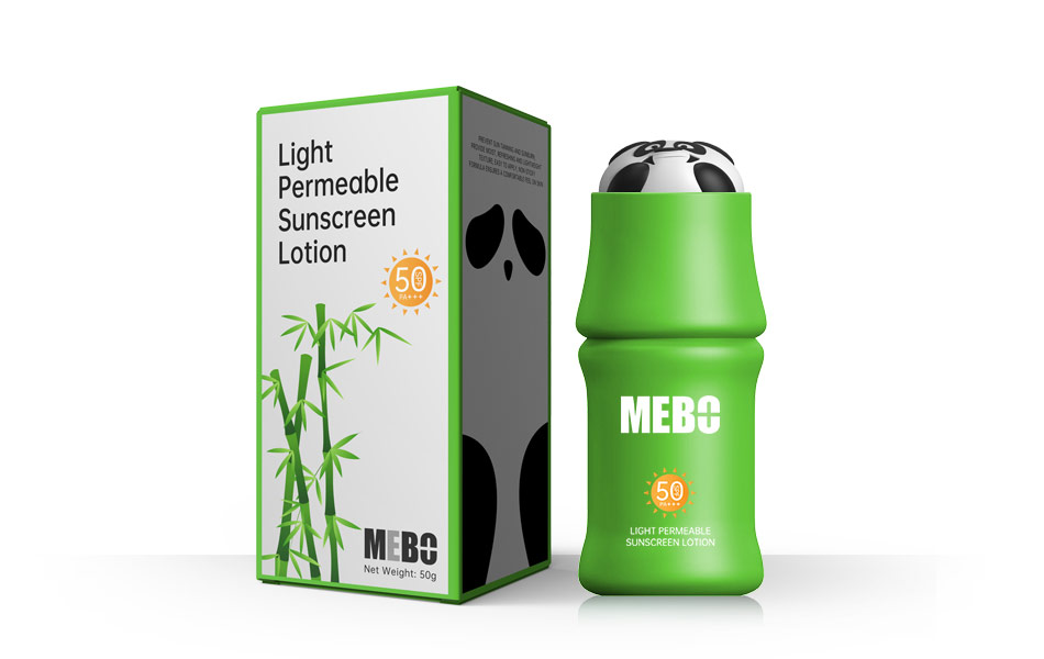
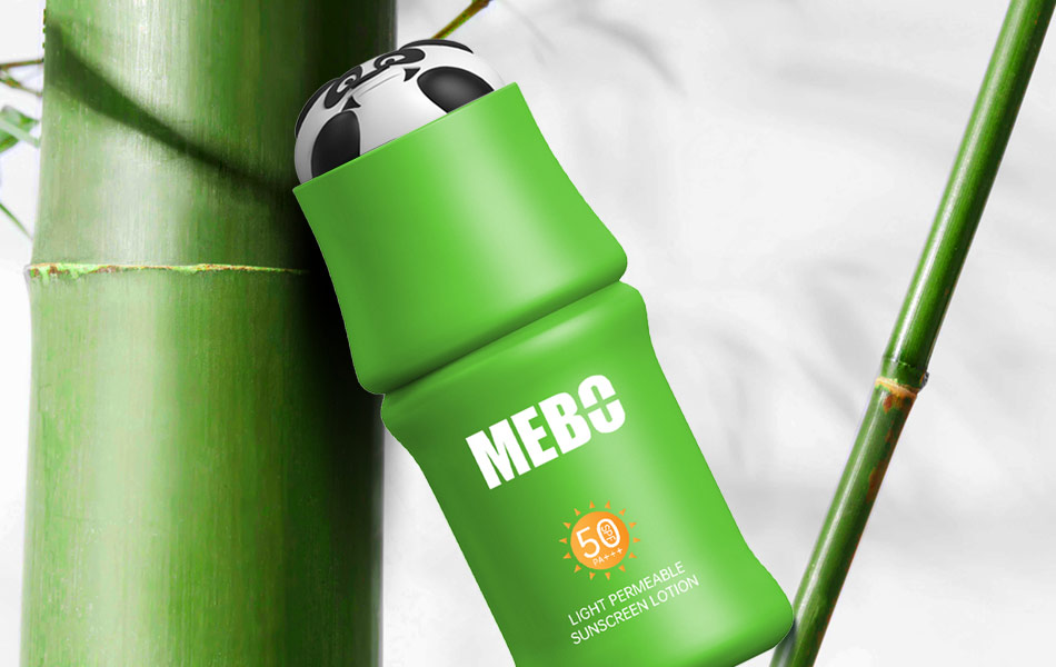
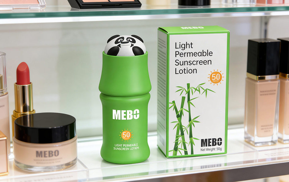
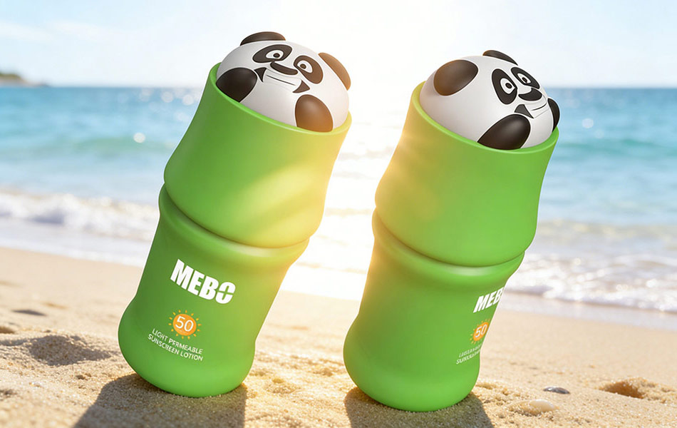
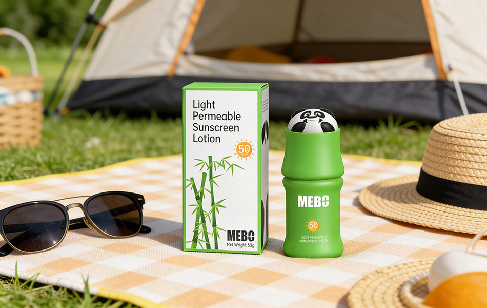
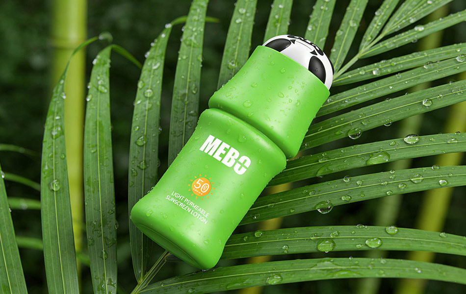
MEBO 为美籍华人创立品牌,承载着创始人对祖国深深的眷恋与家国情怀。宏洛图设计团队紧扣品牌情感内核,甄选大熊猫、小熊猫、竹子三大经典中国文化符号作为核心设计元素,将东方自然意境、国宝萌趣形象与防晒美妆产品属性深度融合。
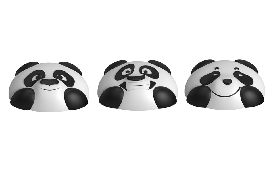
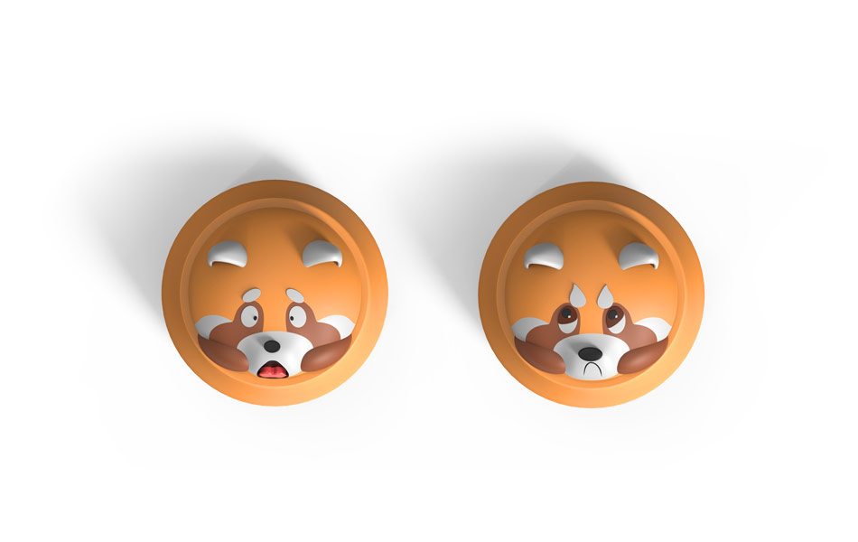
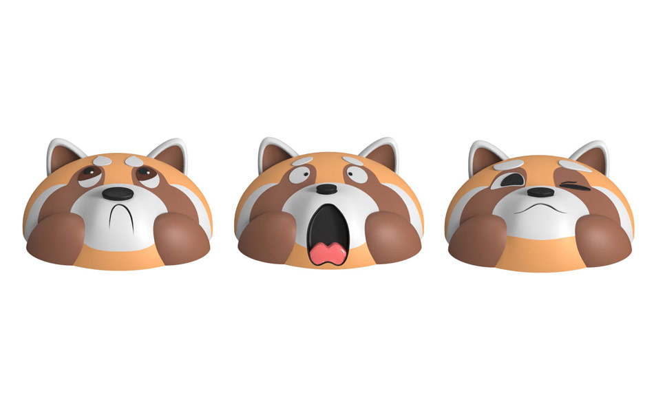
设计前期经过多轮方案研讨、多版熊猫表情造型迭代筛选,反复推敲比例、神态与整体视觉调性,最终定稿呈现当下圆润治愈、国风雅致的成品造型。以熊猫象征家国温情,小熊猫增添灵动萌感,竹子呼应自然绿植、坚韧内敛的东方意蕴,整体打破传统防晒包装的同质化设计,兼具国风美学、情感温度、年轻化潮感,让产品既是护肤好物,更是承载华人思乡情怀的国风艺术设计作品。
提供全流程一站式服务,涵盖策略规划、创意设计、产品研发、3D打样、开模制作、工艺打样及生产交付,全程把控品质,打造兼具国风美学与市场竞争力的防晒产品。
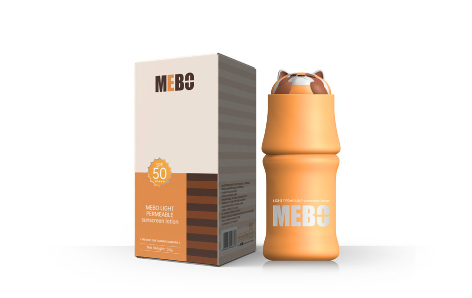
设计前期经过多轮方案研讨、多版熊猫表情造型迭代筛选,反复推敲比例、神态与整体视觉调性,最终定稿呈现当下圆润治愈、国风雅致的成品造型。以熊猫象征家国温情,小熊猫增添灵动萌感,竹子呼应自然绿植、坚韧内敛的东方意蕴,整体打破传统防晒包装的同质化设计,兼具国风美学、情感温度、年轻化潮感,让产品既是护肤好物,更是承载华人思乡情怀的国风艺术设计作品,上市即热销,凭借独特设计与优质体验迅速引爆市场。
创新点 Innovation Highlights
- 双国宝 IP 组合原创设计
- 多版表情迭代甄选定稿
- 国风元素年轻化轻奢表达
- 造型与功能一体化创新
材质与工艺 Material & Craftsmanship
材质选用
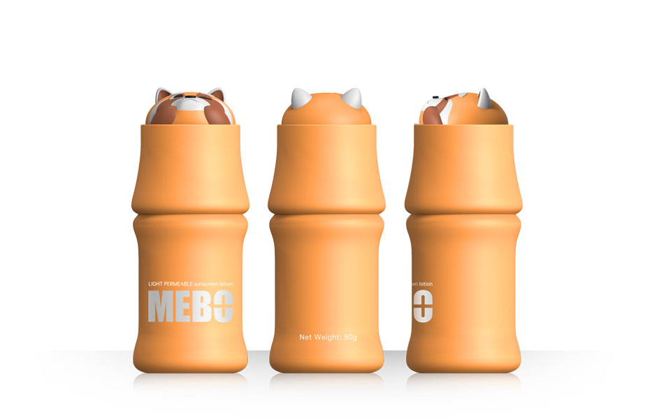
- 瓶身:采用食品级环保 PP 材质,安全无毒、质地轻盈耐摔,便携易出行,化学稳定性强,适配防晒配方存放,绿色环保可回收,契合自然竹韵主题。
- 立体熊猫 / 小熊猫瓶盖:选用高品质 ABS 原生料 + 柔和哑光表层材质,结构坚挺不易变形,立体感强,手感温润细腻,安全无异味。
- 一体注塑成型工艺:瓶身与公仔瓶盖采用高精度注塑一体成型,线条流畅无毛刺,轮廓规整,细节还原度高。
- 环保 UV 哑光喷涂工艺:表层采用进口环保 UV 喷涂,色泽均匀高级,防刮耐磨、不易掉色,质感轻奢高级。
- 精密螺纹密封工艺:瓶盖与瓶身精准螺纹匹配,开合顺滑紧致,密封防漏,有效防止防晒膏体氧化变质。
- 精细分层上色工艺:熊猫五官、毛色、细节采用分层精工上色,边缘清晰不晕色,立体层次感十足,长久使用依旧如新。
Honglt Brand Design | MEBO Panda Series Sunscreen
Design Concept
This MEBO sunscreen product is originally designed by Hongluotu Brand Design Company. Founded by a Chinese-American, MEBO carries the founder’s deep nostalgia for China. Our design team takes giant panda, red panda and bamboo as core Chinese cultural elements, integrating oriental artistic conception and national treasure IP with sunscreen product positioning.
After multiple rounds of discussion and repeated iteration of panda facial expressions, we finalized the current cute and elegant design. The design combines national sentiment, natural aesthetics and youthful trendiness, making the product both a daily skincare essential and an emotional carrier of Chinese cultural feelings.
Innovation Highlights
- Original dual IP design of giant panda & red panda with bamboo element, high recognition and unique visual layering.
- Multiple expression versions drafted and strictly selected to confirm the most suitable and healing appearance for the brand.
- Youthful and light luxury interpretation of Chinese style, breaking homogenization of traditional sunscreen packaging.
- Integrated design of 3D modeling and practical function, balancing beauty, hand feel and sealing performance.
- Material: Food-grade eco-friendly PP for bottle body; high-quality ABS material for panda cap, safe, lightweight, drop-resistant and durable.
- Craftsmanship: Integrated injection molding, environmental UV matte spraying, precise thread sealing technology and layered fine coloring, smooth texture, scratch-proof, fade-proof and excellent airtight performance.
联系电话:13660525504
上一篇:法国护肤品LABOBIO品牌包装设计
下一篇:美国索贝SOBEI品牌包装设计包装设计