a8s口服补充剂包装设计 | 宏洛图品牌设计出品
a8s Oral Supplement Packaging Design | Designed by Honglt Brand Design
品类|Category:高端保健品/膳食补充剂系列
Premium Health Products / Dietary Supplement Series
服务|Service:全系列包装设计、视觉体系规范
Full Series Packaging Design & Visual System Specification
风格|Style:极简现代、科技感
Minimalist Modern & Color Differentiation
设计机构:宏洛图品牌设计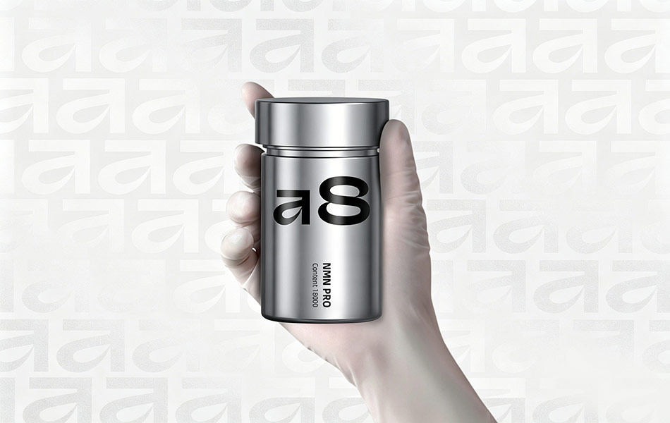


一、设计理念:以极简科技美学,重构抗衰产品的专业叙事
Design Concept: Reimagining the Professional Narrative of Anti-Aging Products with Minimalist Tech Aesthetics宏洛图基于对高端抗衰赛道的深度洞察,为「a8」系列打造了一套兼具未来感与信任感的包装体系,核心设计理念围绕以下三大维度展开:
Hongluotu, based on in-depth insights into the high-end anti-aging track, has created a packaging system for the "a8" series that balances futurism and trustworthiness. The core design concept revolves around three key dimensions:
- 「科技抗衰」的视觉表达
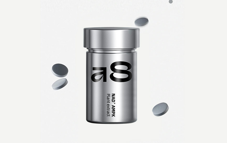
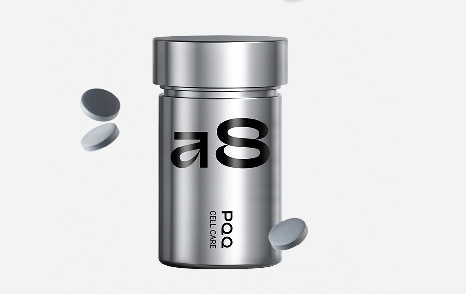
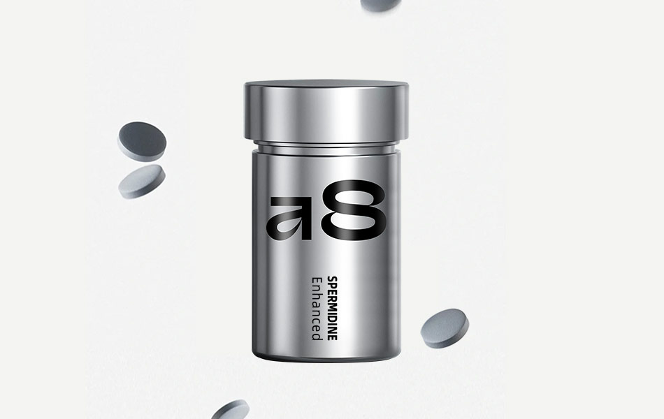
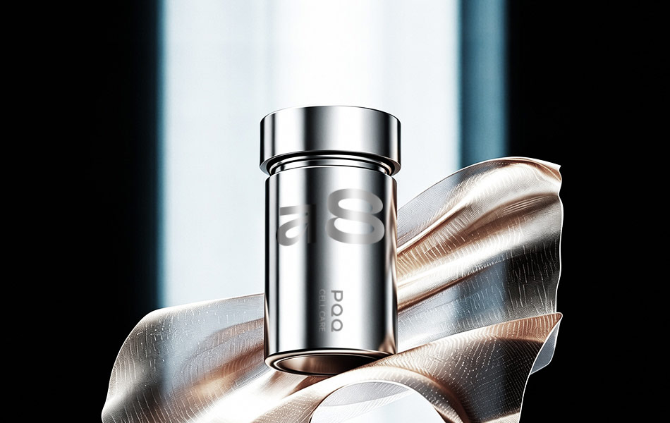
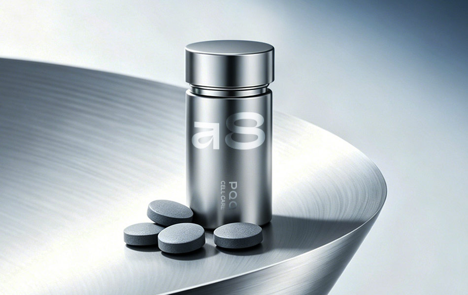
针对 PQQ、NMN、AMPK、亚精胺等高端抗衰成分的特性,我们摒弃了传统保健品的温和调性,以高纯度金属银为主视觉语言,传递「精准、高效、前沿」的科技感。瓶身的金属光泽如同精密仪器,隐喻产品对细胞级养护的专业能力,让用户在接触产品的第一时间,感知到品牌的技术实力与产品价值。
Tailored to the properties of premium anti-aging ingredients such as PQQ, NMN, AMPK, and Spermidine, we moved beyond the gentle tone of traditional health supplements, using high-purity metallic silver as the primary visual language to convey a sense of "precision, efficiency, and innovation". The bottle’s metallic sheen, reminiscent of precision instruments, symbolizes the product’s professional capacity for cellular-level care, allowing users to perceive the brand’s technical strength and product value the moment they interact with the item.
- 「极简符号」的品牌识别
设计核心以「a8」为超级符号,采用无衬线粗体字,通过镜像反转的「a」与几何化的「8」构建强烈的视觉记忆点,打破传统保健品的文字堆砌模式。「8」的循环形态也暗含「焕活细胞、延缓衰老」的产品主张,将抽象的抗衰概念转化为具象的视觉符号,强化品牌的差异化认知。
At the heart of the design is the "a8" supersymbol, rendered in bold sans-serif typeface. The mirrored "a" and geometric "8" create a striking visual anchor, breaking free from the text-heavy conventions of traditional health supplements. The cyclical shape of the "8" subtly embodies the product’s promise of "revitalizing cells and delaying aging", translating abstract anti-aging concepts into tangible visual symbols and strengthening the brand’s differentiated identity.
- 「纯净专业」的价值传递
瓶身以极简排版呈现核心成分与功效(如 “PQQ CELL CARE”“NMN PRO 18000”),无冗余装饰,以「少即是多」的设计语言传递产品的纯净配方与科学背书。冷调金属银搭配高对比黑色文字,营造出实验室级的严谨氛围,精准触达追求专业、理性的高端消费者群体。
The bottle features core ingredients and benefits (e.g., "PQQ CELL CARE", "NMN PRO 18000") in a minimalist layout, free of unnecessary embellishments. The "less is more" design language communicates the product’s pure formula and scientific backing. The cool metallic silver paired with high-contrast black text creates a laboratory-grade atmosphere of rigor, precisely resonating with professional, rational high-end consumers.
二、创新点:突破传统保健品包装的边界
Innovation Points: Redefining the Boundaries of Traditional Health Supplement Packaging- 颠覆性材质语言
区别于市面上常见的塑料瓶、纸质包装,本系列采用金属质感瓶身作为核心载体,将保健品从 “药品 / 补品” 的刻板印象中剥离,升级为兼具科技感与高级感的「生活方式单品」。金属材质不仅强化了产品的专业属性,更让包装本身成为品牌的标志性视觉资产。
Unlike common plastic or paper packaging on the market, this series uses metallic-finish bottles as its core carrier, transforming health supplements beyond the stereotype of "medicine/supplements" into tech-forward, premium "lifestyle items". The metallic material not only reinforces the product’s professional attributes but also turns the packaging itself into a signature visual asset for the brand.
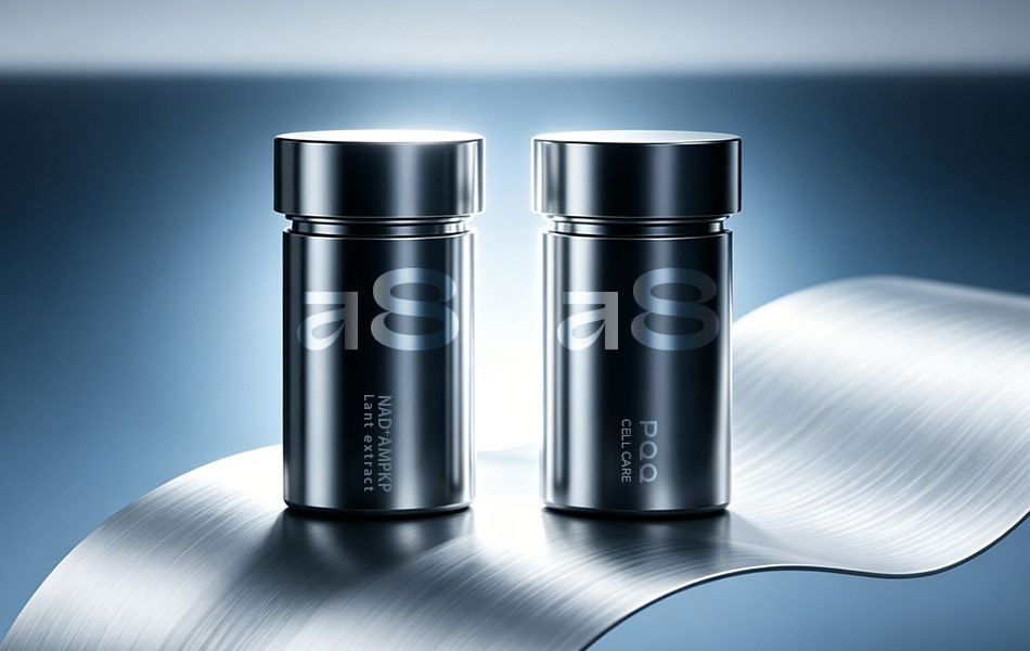
- 模块化的系列化设计
为不同成分的抗衰产品打造了统一的瓶型结构,通过瓶身文字区分产品线,形成高度识别的家族式视觉系统。这种设计既降低了系列产品的认知成本,又通过统一的金属瓶身传递品牌的高端调性,实现 “一眼识别、过目不忘” 的传播效果。
A unified bottle structure was created for anti-aging products with different ingredients, with product lines differentiated by text on the bottle to form a highly recognizable family visual system. This design reduces cognitive costs for the series while conveying the brand’s premium positioning through consistent metallic bottles, achieving a "recognizable at a glance, memorable for life" communication effect.
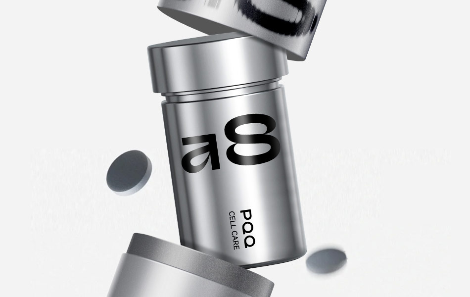
- 动态化的场景叙事
产品视觉呈现中,通过瓶盖开合、药片悬浮的动态画面,构建了「开箱 - 使用」的完整场景联想。这种设计突破了静态包装的局限,让用户直观感知产品的形态与质感,传递出「便捷、高效」的使用体验,强化产品与用户的情感连接。
In the product visuals, dynamic scenes of the cap opening/closing and tablets floating build a complete narrative from "unboxing to use". Breaking the limitations of static packaging, this design allows users to intuitively perceive the product’s form and texture, conveying a "convenient and efficient" user experience and strengthening the emotional connection between the product and consumers.
三、材料与工艺:以极致工艺,还原科技美学质感
Materials & Craftsmanship: Recreating Tech Aesthetic with Exquisite Craftsmanship1. 核心材料选择
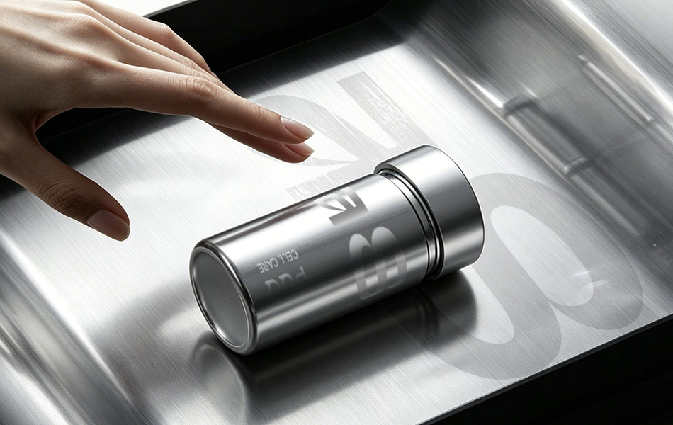
Core Material Selection- 主体瓶身:采用食品级铝合金基材,兼具轻量化与安全性,同时金属材质的稳定性可更好地保护活性成分,延长产品保质期;表面采用镜面 / 哑光银两种质感处理,既还原了科技感,又兼顾了握持的舒适手感。
- 瓶盖结构:采用双层旋盖设计,外层为金属质感阳极氧化铝,内层为食品级 PP 密封层,在保证密封防潮的同时,通过精密车削工艺实现顺滑开合,提升使用体验。
- 印刷与标识:瓶身文字采用高精度激光雕刻 + UV 黑色油墨印刷工艺,文字清晰耐磨,避免传统丝印易脱落的问题,长期使用仍能保持包装的完整性与高级感。
2. 关键工艺亮点
Key Craftsmanship Highlights- 阳极氧化工艺:铝合金瓶身通过阳极氧化处理,形成细腻的金属肌理,提升抗刮擦能力的同时,赋予瓶身柔和的金属光泽,避免廉价的塑料仿金属质感。
- 无涂层环保处理:瓶身表面采用环保型金属保护涂层,无有害物质析出,同时保持金属材质的原生质感,兼顾食品安全与视觉美学。
- 模块化适配工艺:统一瓶型结构可适配不同规格的片剂产品,通过调整瓶身高度实现多 SKU 兼容,降低品牌量产成本,同时保证系列产品的视觉统一性。
四、设计价值:助力品牌构建高端抗衰赛道差异化优势
Design Value: Empowering Brands with Differentiated Advantages in the High-End Anti-Aging Track宏洛图通过本次「a8」系列包装设计,为品牌打造了一套从视觉到体验的完整价值体系:
Through the "a8" series packaging design, Hongluotu has built a complete value system for the brand, spanning from visuals to user experience:
- 以金属科技风的包装,精准匹配高端抗衰产品的目标用户需求,强化品牌的专业与高端定位;
- 极简符号与模块化设计,让品牌在同类产品中脱颖而出,降低用户识别与记忆成本;
- 食品级金属材质与精密工艺,兼顾产品功能性与安全性,实现 “颜值、质感、实用性” 三者的完美平衡。
Food-grade metallic materials and precision craftsmanship balance product functionality and safety, achieving the perfect harmony of "aesthetics, texture, and practicality".
宏洛图始终深耕美妆健康赛道,以 “专研垂直领域,打造可落地的差异化设计” 为核心,助力品牌从视觉到市场实现价值跃升。
Hongluotu remains deeply rooted in the beauty and health sector, focusing on "specializing in vertical fields to create actionable, differentiated designs" and empowering brands to achieve value leaps from visuals to market performance.
联系电话:13660525504
上一篇:返回列表
下一篇:美国Maritime Collagen精氨酸系列包装设计理念