THE TREE OF LIFE 保健品包装设计
极简美学+色彩战略,打造高辨识度健康产品视觉
Minimalist Aesthetics + Color Strategy, Creating HighRecognition Health Product Vision
客户|Client:THE TREE OF LIFE
品类|Category:高端保健品/膳食补充剂系列
Premium Health Products / Dietary Supplement Series
服务|Service:全系列包装设计、视觉体系规范
Full Series Packaging Design & Visual System Specification
风格|Style:极简现代、色彩差异化
Minimalist Modern & Color Differentiation
设计机构:宏洛图品牌设计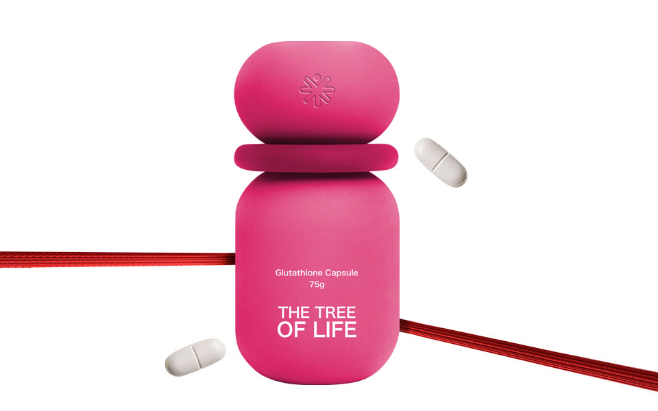
设计亮点|Design Highlights
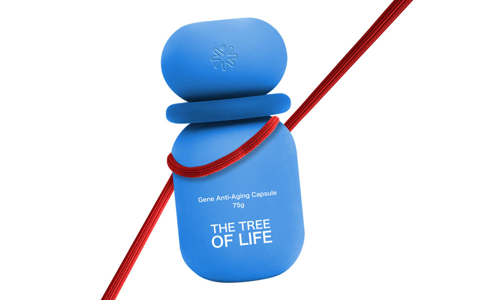
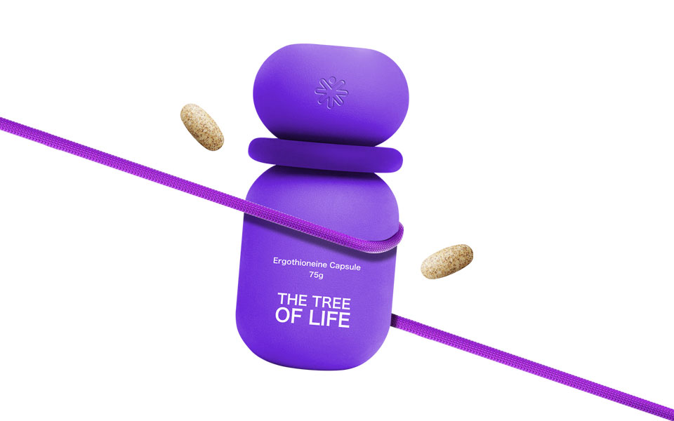
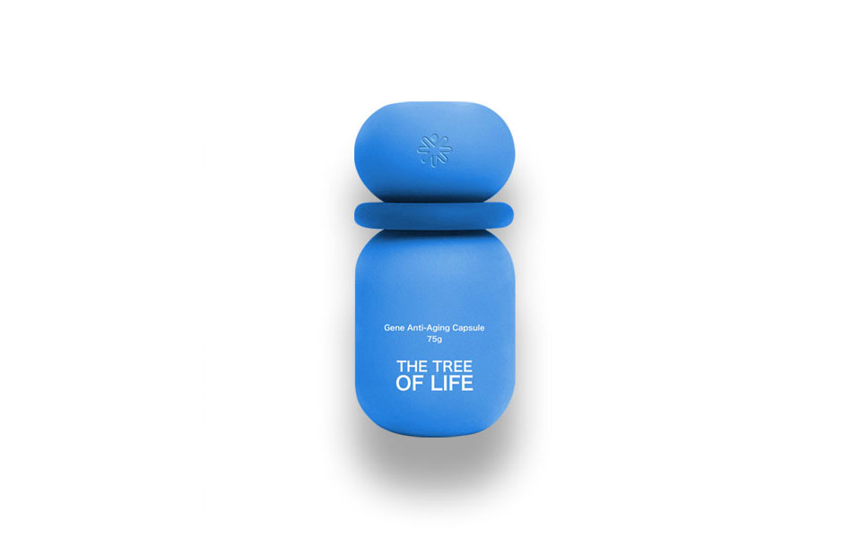
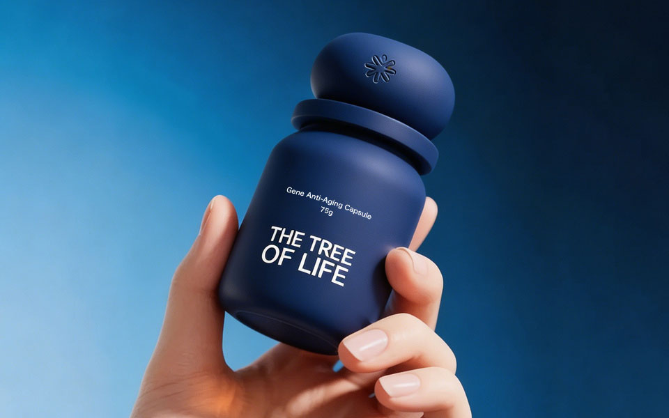
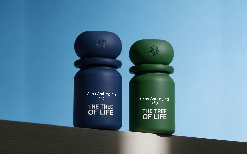
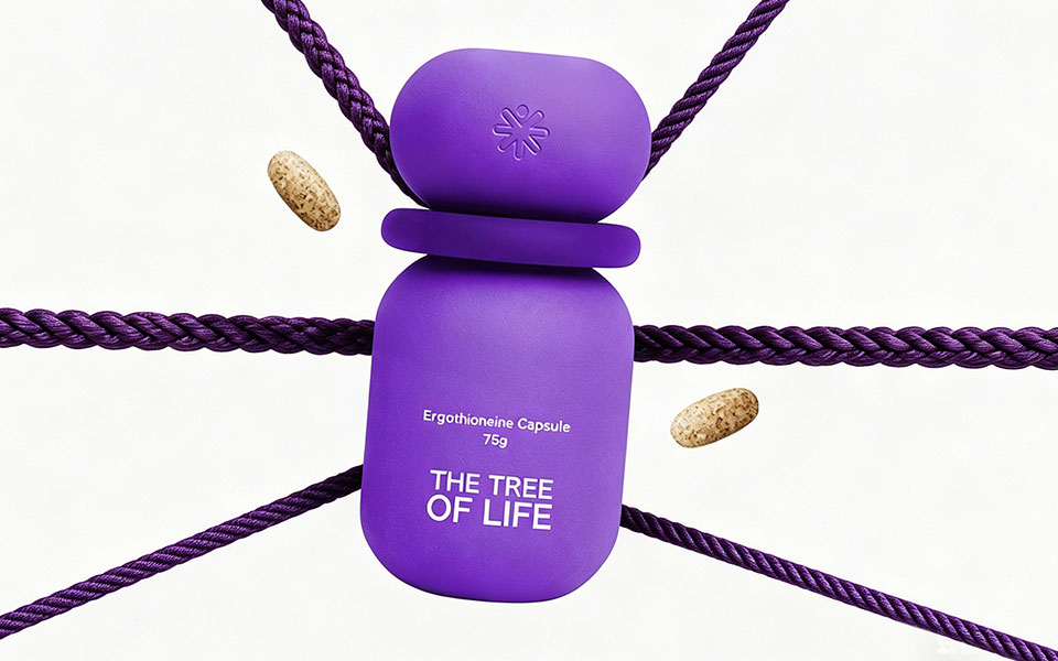
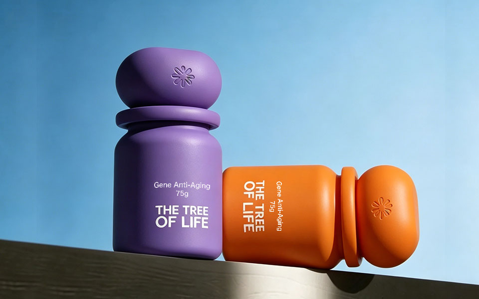
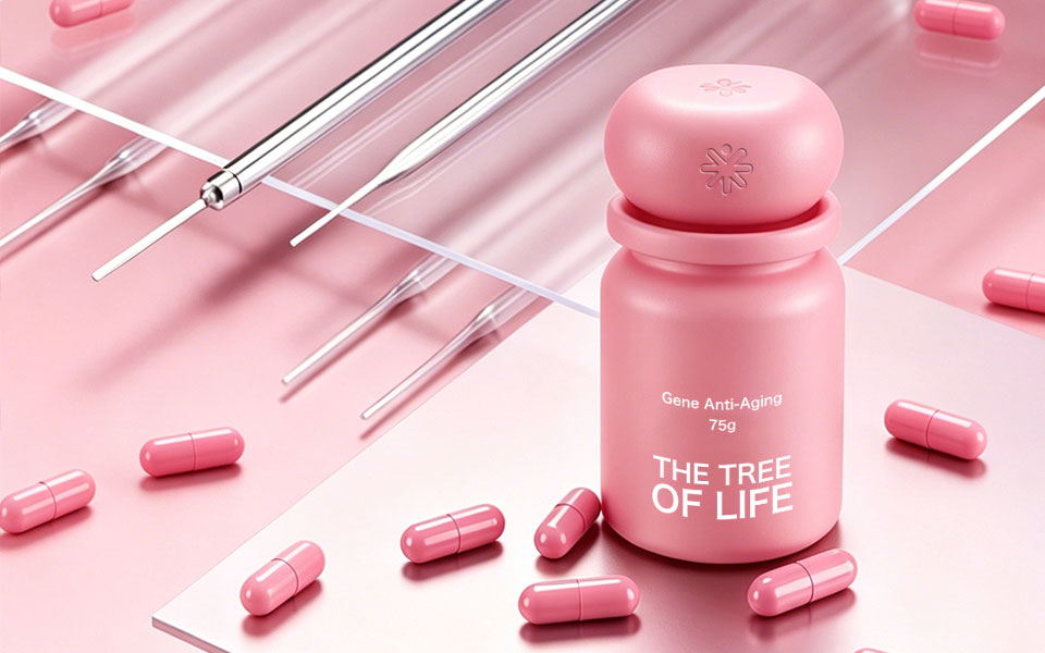
以胶囊式瓶型为基础,用高饱和色彩区分不同功效产品,强化品牌LOGO符号,打造统一且差异化的系列包装,提升品牌识别度与市场竞争力。
Based on a capsuleshaped bottle, highsaturation colors distinguish products by function. The brand LOGO is strengthened to create unified and differentiated series packaging, improving brand recognition and market competitiveness.
项目总结|Project Summary
本次THE TREE OF LIFE全系列保健品包装设计,宏洛图品牌设计以「色彩为差异化,极简为核心」,为品牌打造了一套专业、高端、高识别度的包装体系。
For this fullseries health supplement packaging design of THE TREE OF LIFE, Honglotu Brand Design adopted "color differentiation and minimalism as the core" to create a professional, highend, and highly recognizable packaging system for the brand.
设计不仅提升了产品的视觉质感与市场竞争力,更帮助品牌建立了专属的视觉资产,实现了美学价值与商业价值的双重落地。
The design not only improves the visual texture and market competitiveness of the products, but also helps the brand build exclusive visual assets, achieving the dual realization of aesthetic value and commercial value.
联系电话:13660525504
上一篇:OON 营养补充剂包装设计
下一篇:安舒仁淫羊藿参芪胶囊包装设计案例